Connatix
Case study
Connatix is a video platform that allows users to upload and import videos, create playlists and configure video players that can be embedded into websites or mobile apps. It also allows running ads programatically in the video players, set different view rates or create and export reports and financial statements.
Since I joined the company in 2021 I took care of the UI design of the platform. I worked closely with product managers, software developers and other stakeholders to build new features and improve existing ones and to build and maintain a design system. Below are some of the things I worked on:
1. Figma and Angular Material UI
I used Figma to design and document custom UI components, to illustrate user flows and to build clickable prototypes. These helped eveyone involved in the development process to better understand and communicate how features should look and behave. To ensure development performance and reliability, we used Angular Material components that we customized within the bounds of the Material Design specification.
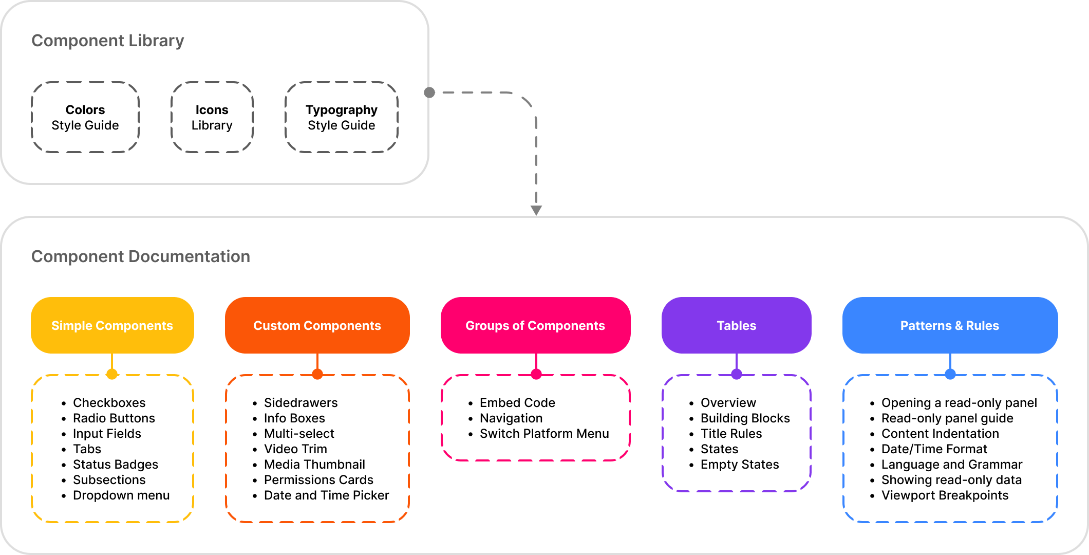
2. Design system
To support the components customizations and to document different patterns and behaviors we built a design system. The key ingredients to build this were to understand the capabilities and the constraints of Angular Material and to work closely with the frontend developers to estimate the effort for any customization. Below you can see an illustration with the pieces of the design system:
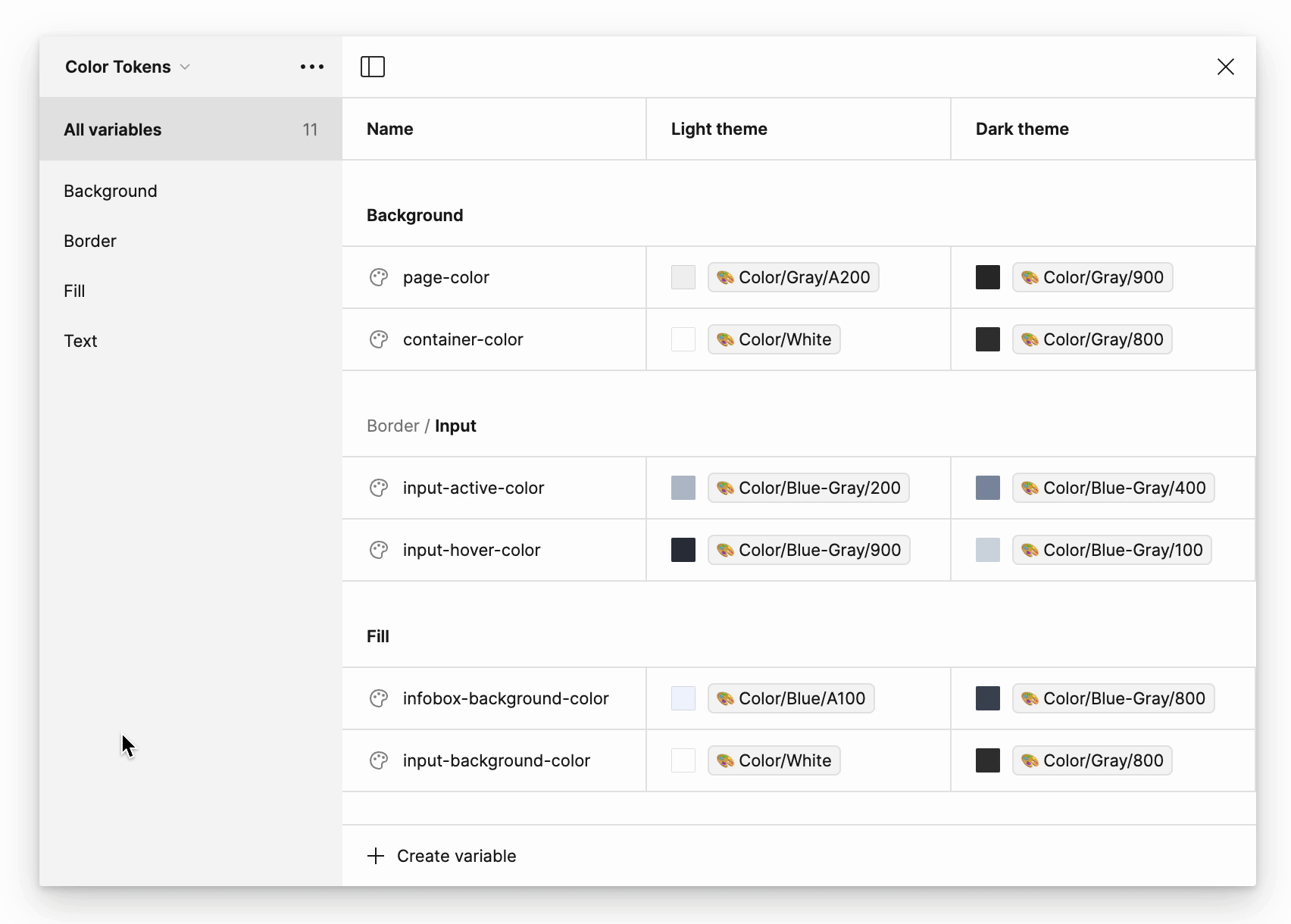
Since Figma introduced variables I wanted to make sure we have a better alignment and handling of colors and fonts properties between design and code, so I'm currently working on defining and applying color tokens to our components (typography tokens and dark colors theme are coming soon). Below you can see a preview of the color primitives and tokens:
3. UI components in action
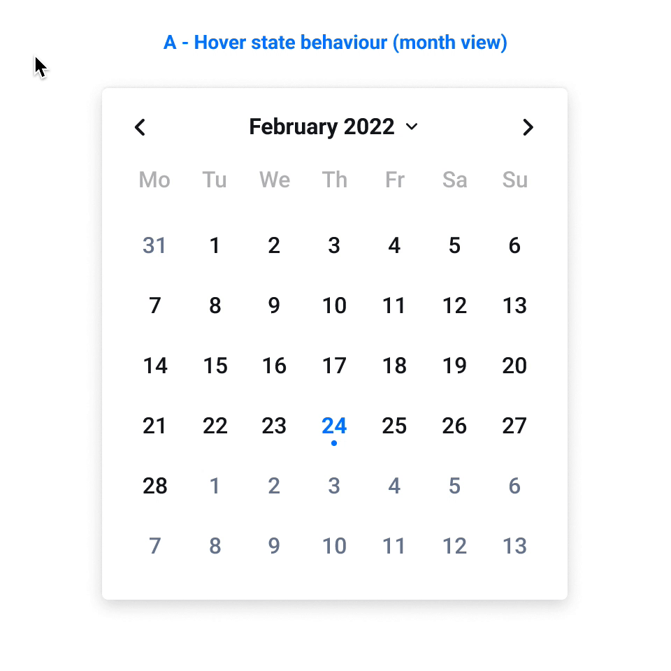
Below are some examples of components I designed and documented that include details such as: variants and anatomy, when to be used, states, behaviors (with prototypes), sizes and style specs.
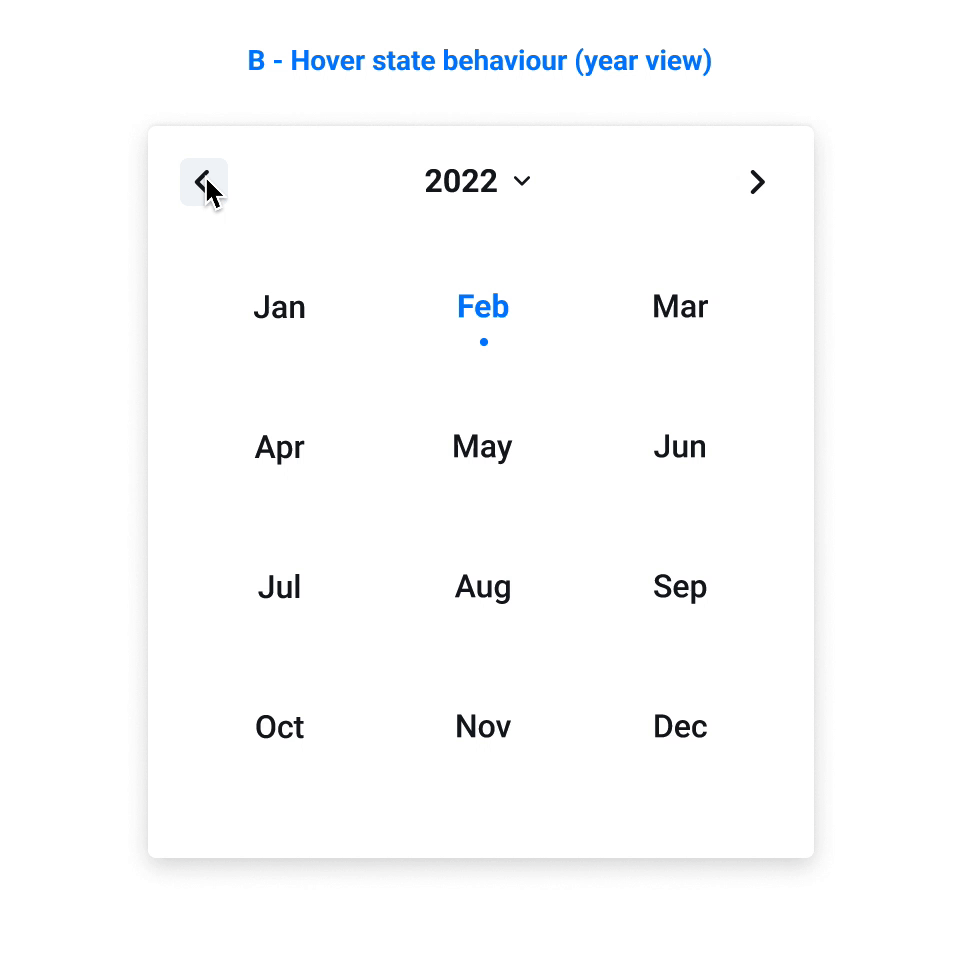
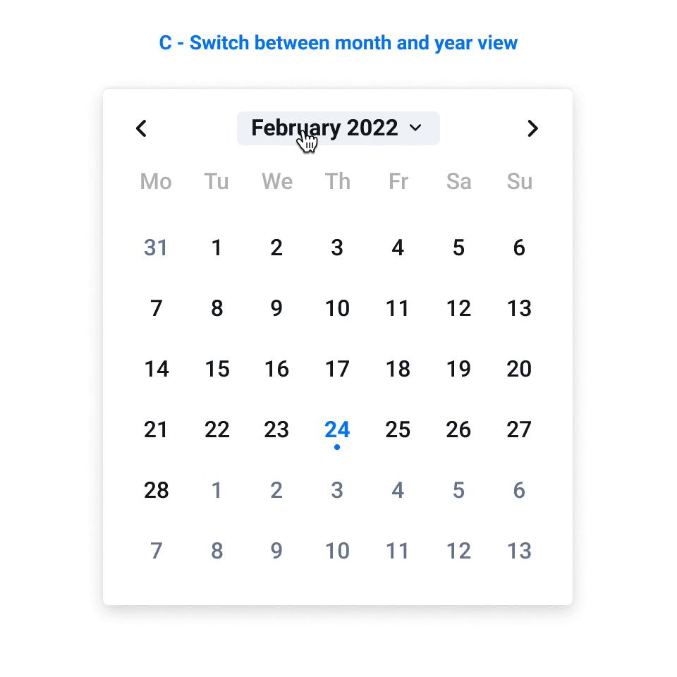
3.1. Date and time picker
3.2. Video Card
3.3. Dialog Modal
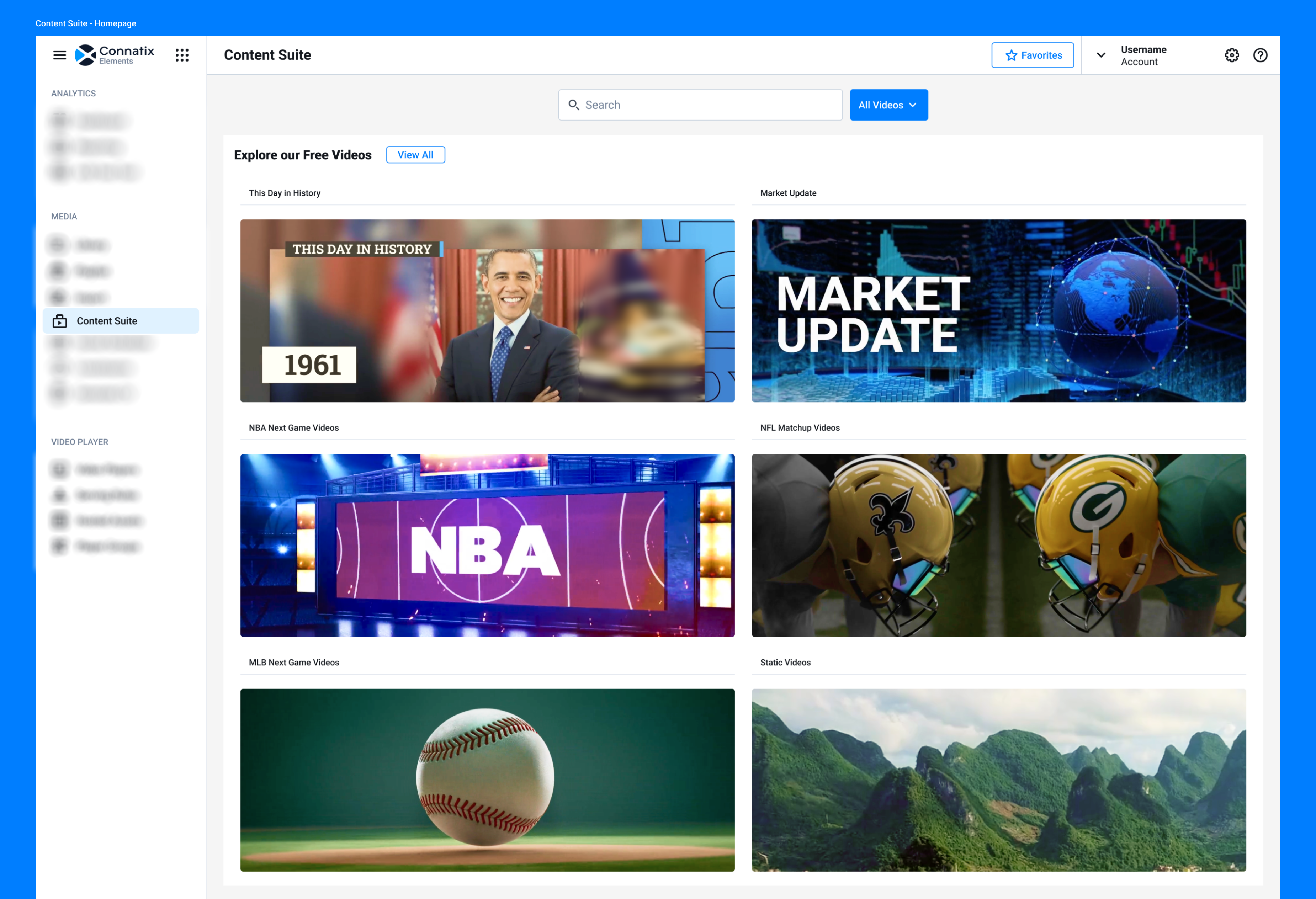
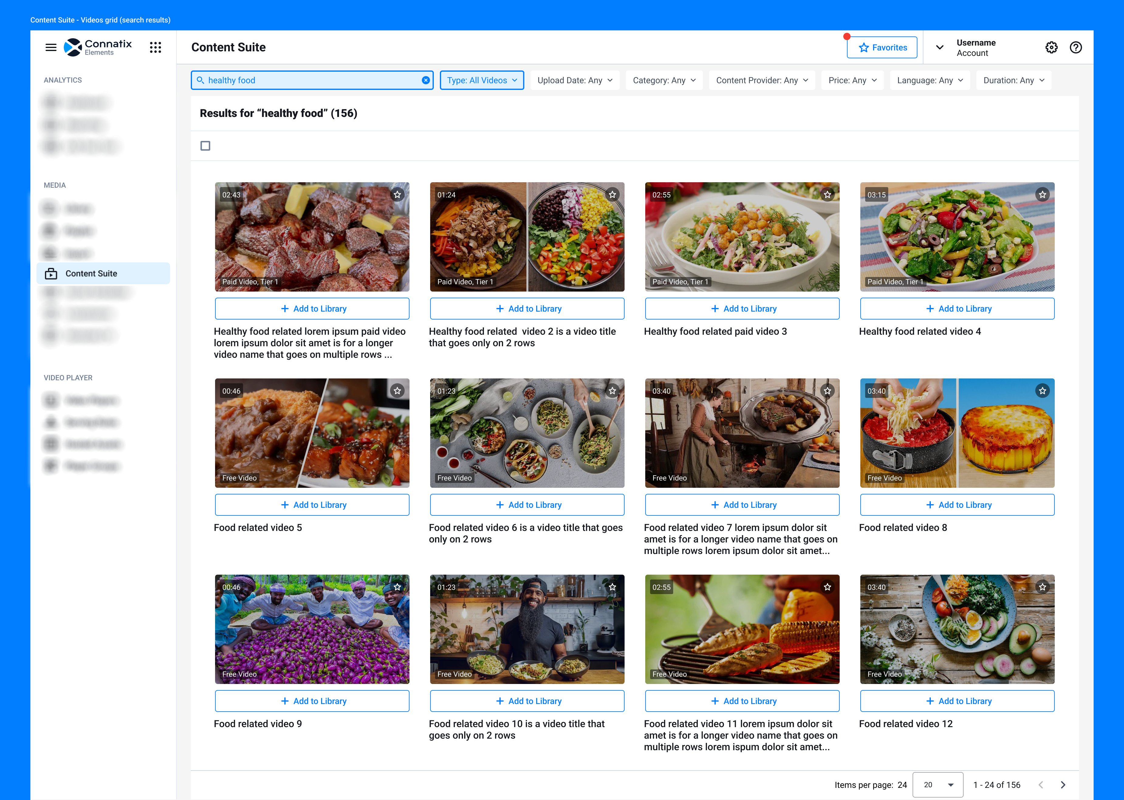
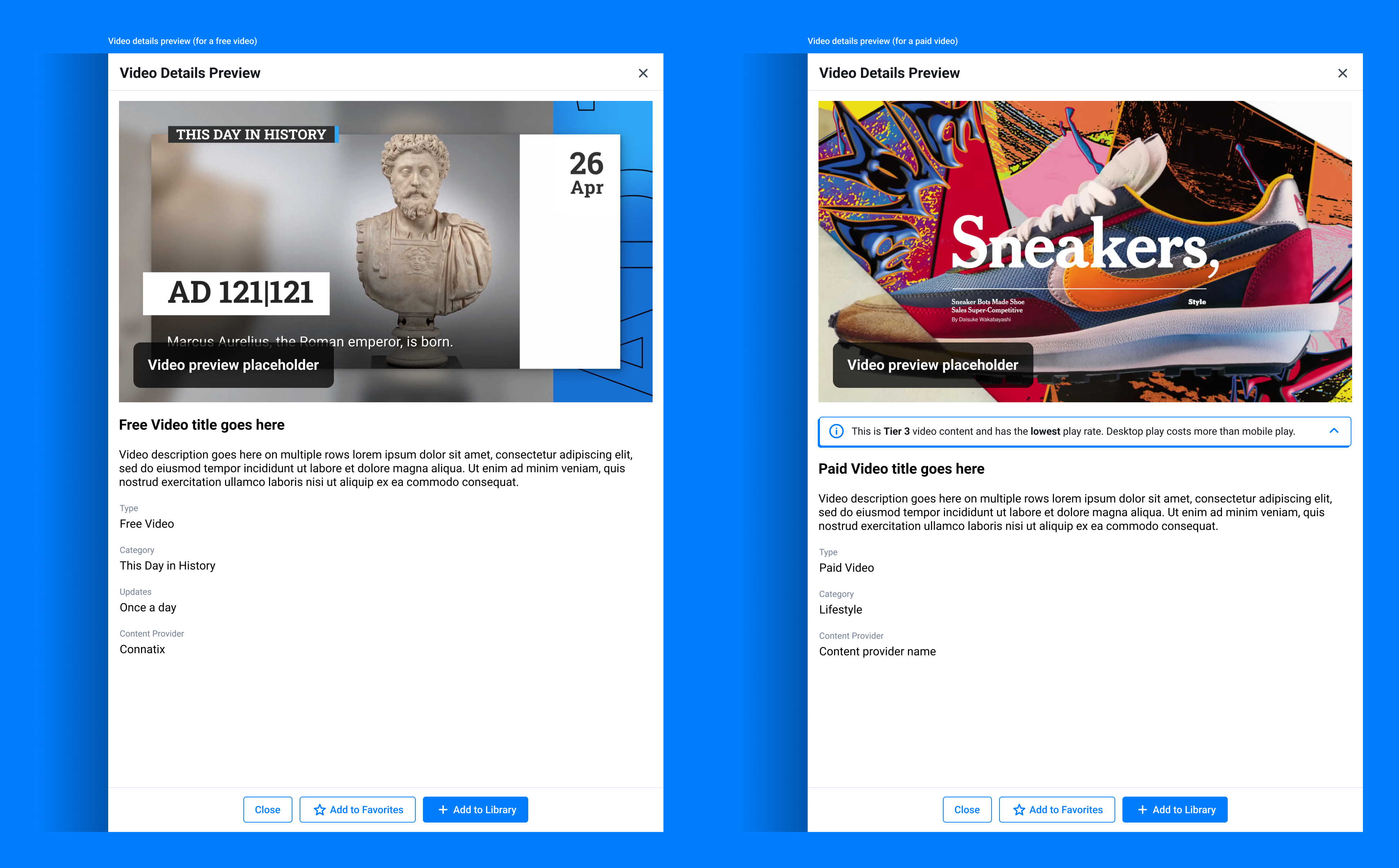
4. Content Suite design
Apart from the user upload functionality of the platform, Connatix also offers a number of free and paid videos. With all these offerings we changed the overall user experience of our content suite, so users can clearly understand what we have to offer and feel empowered to use their desired content.
I was in charge with designing the new homepage for the Content Suite and defining new functionalities and user flows.
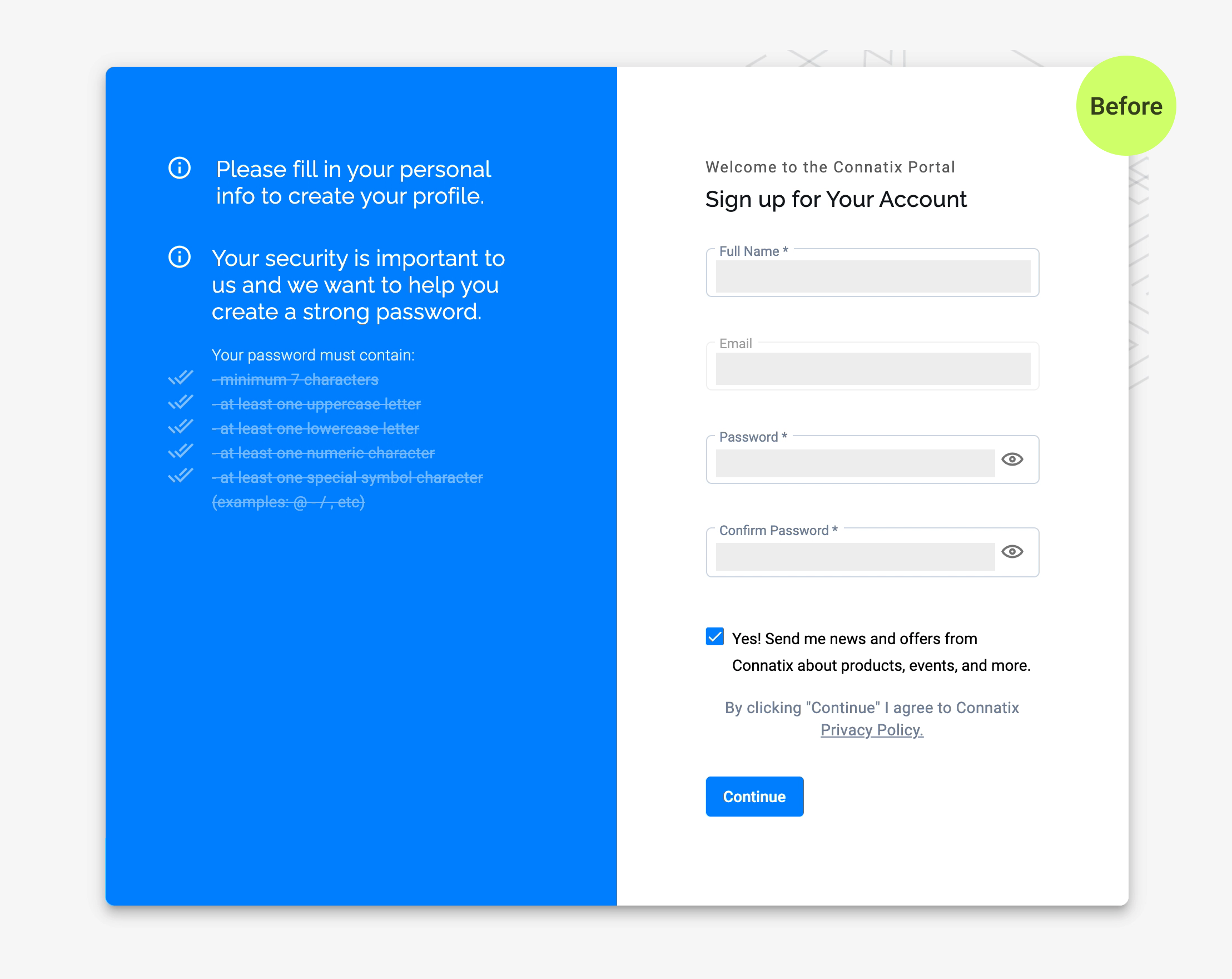
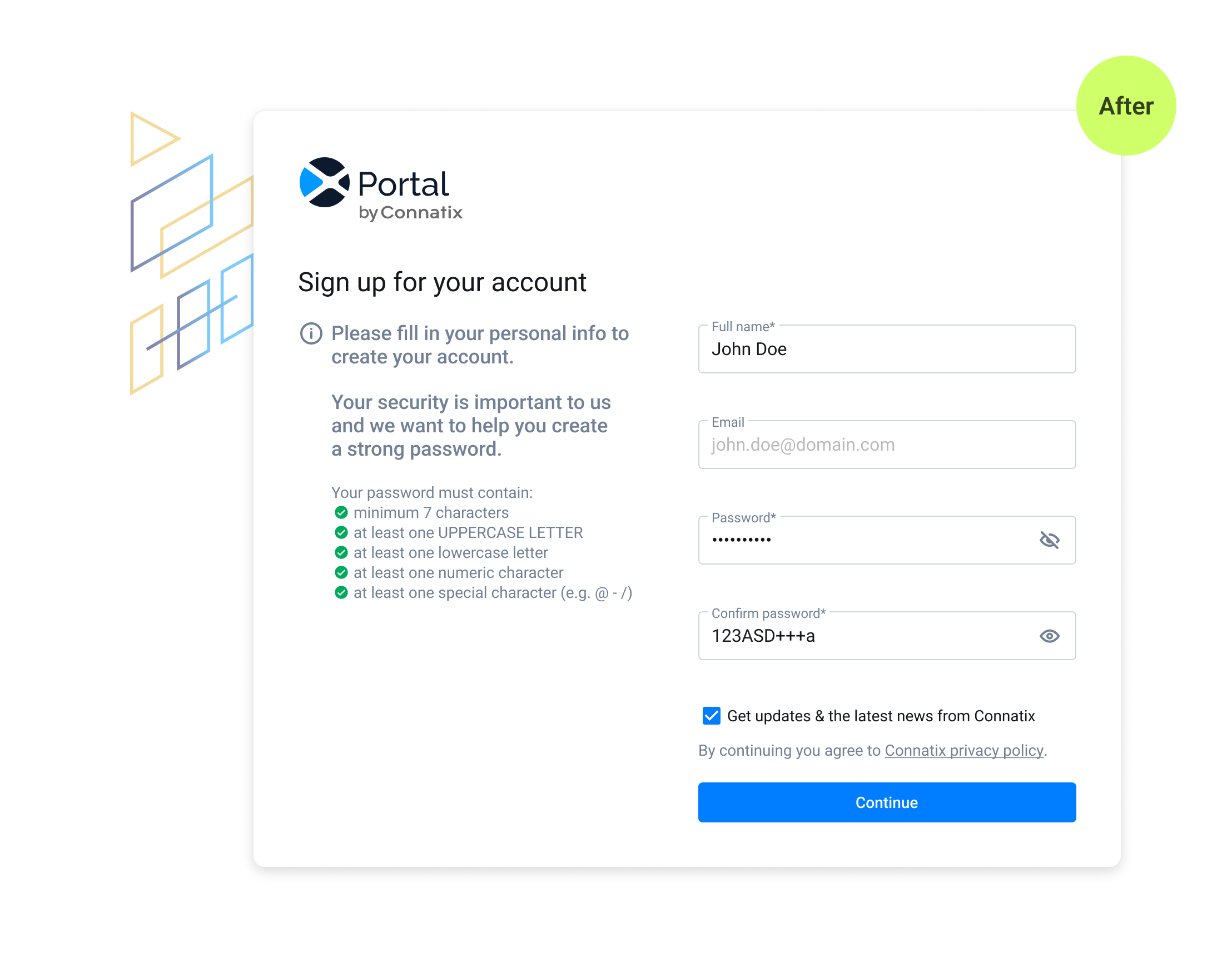
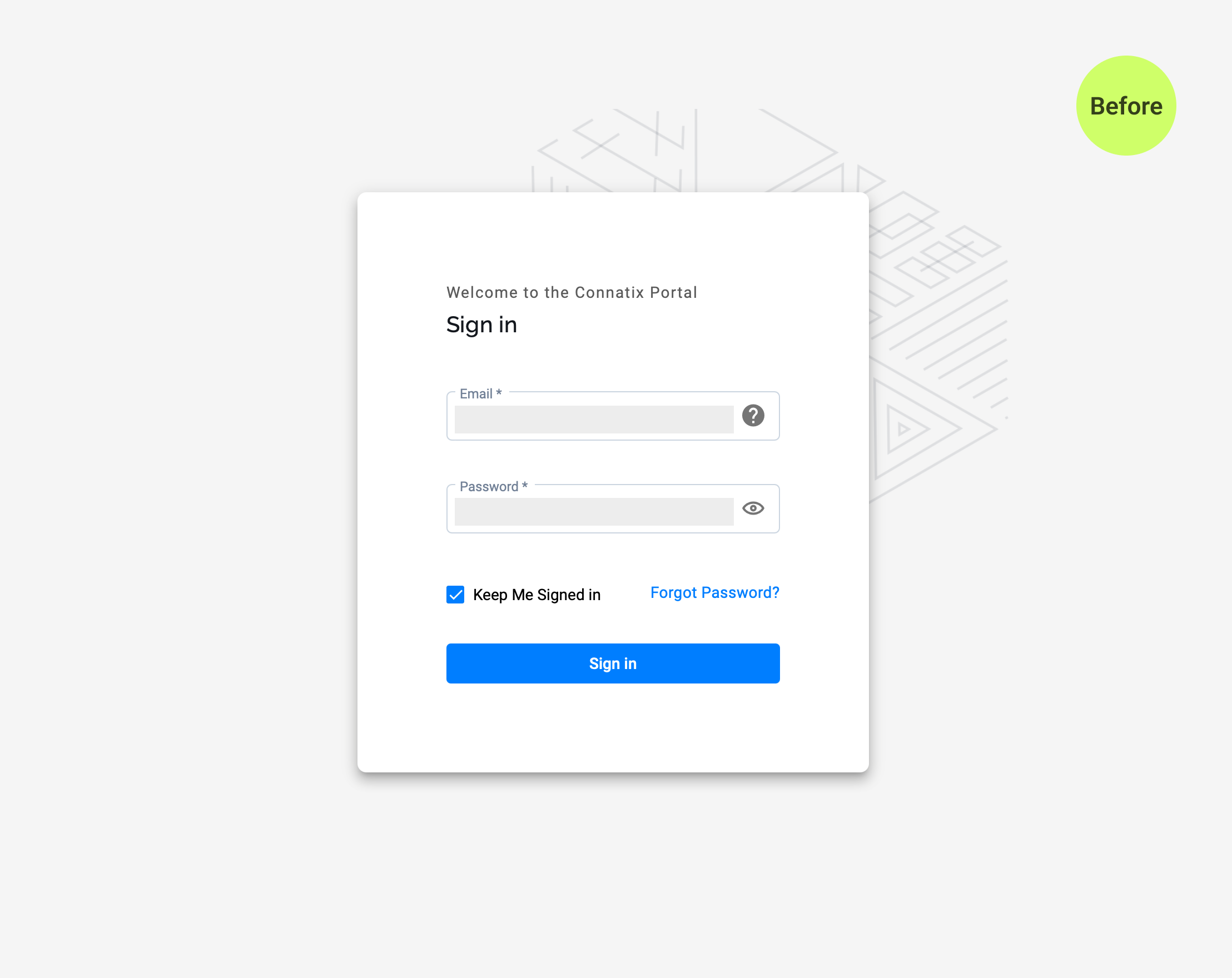
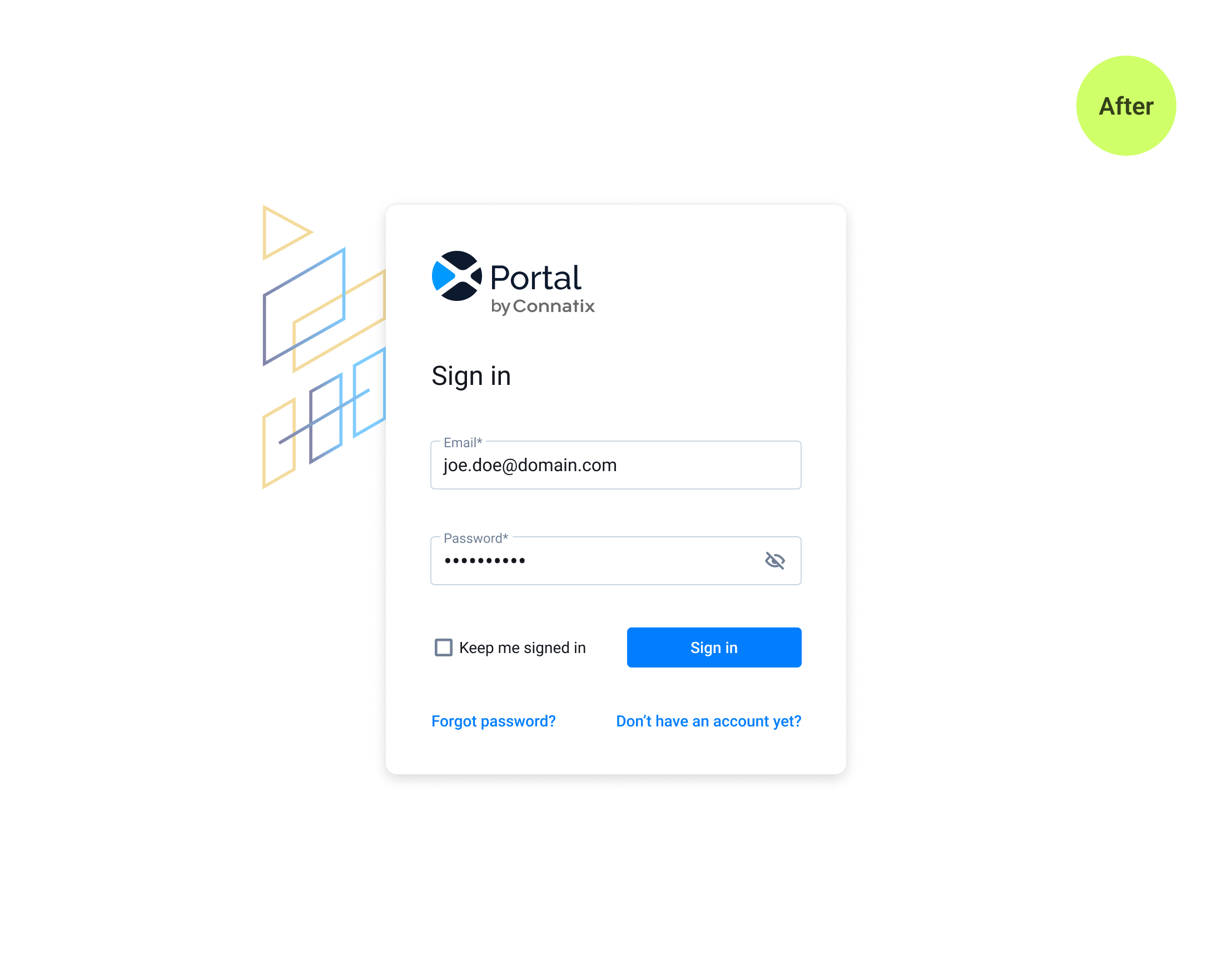
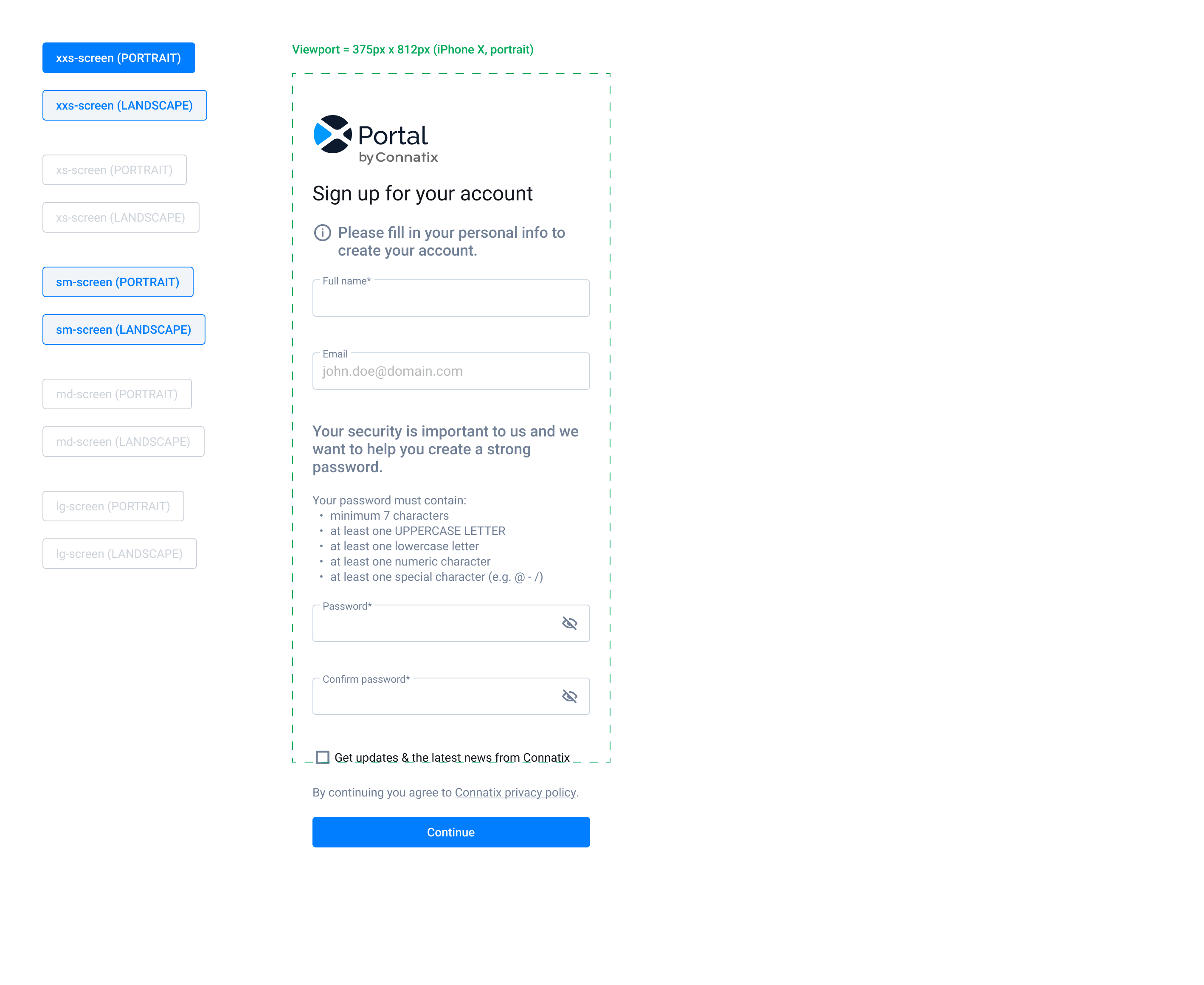
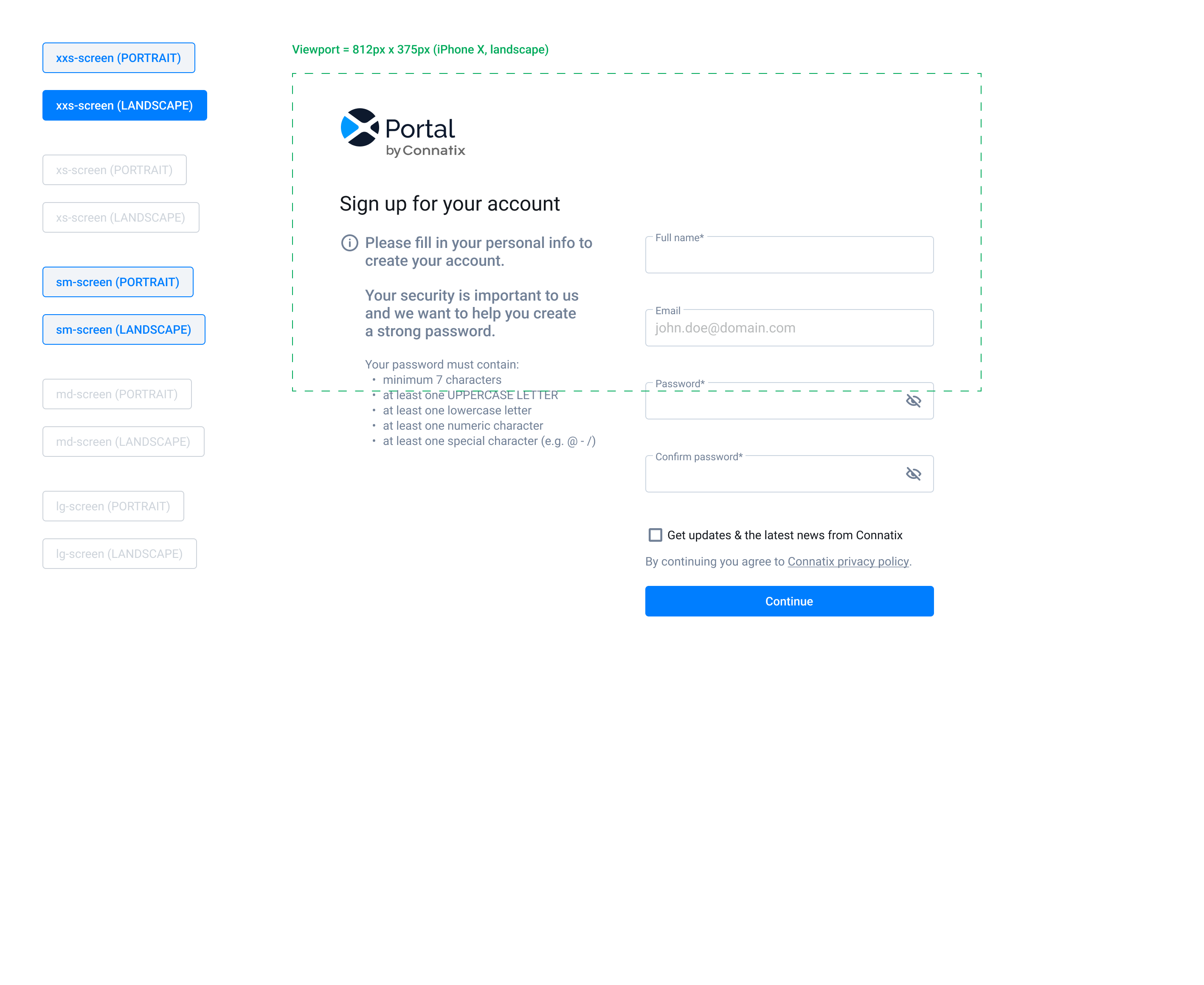
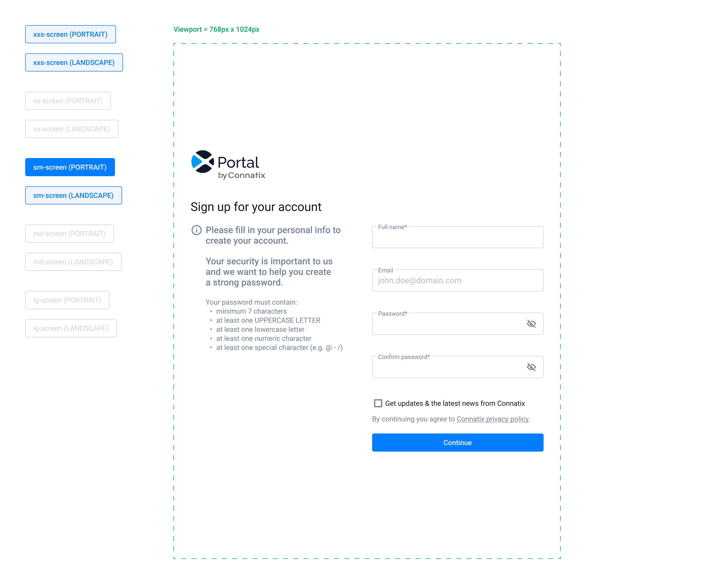
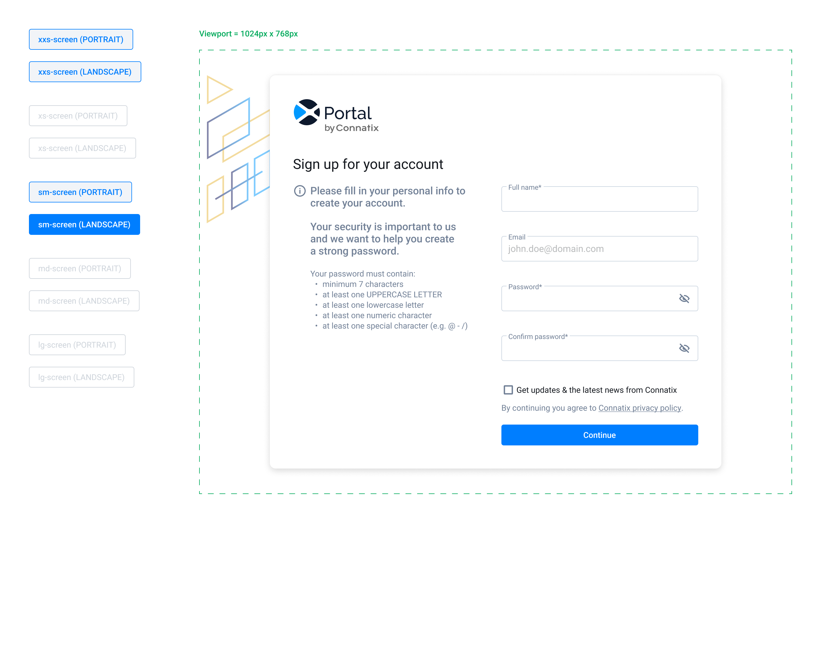
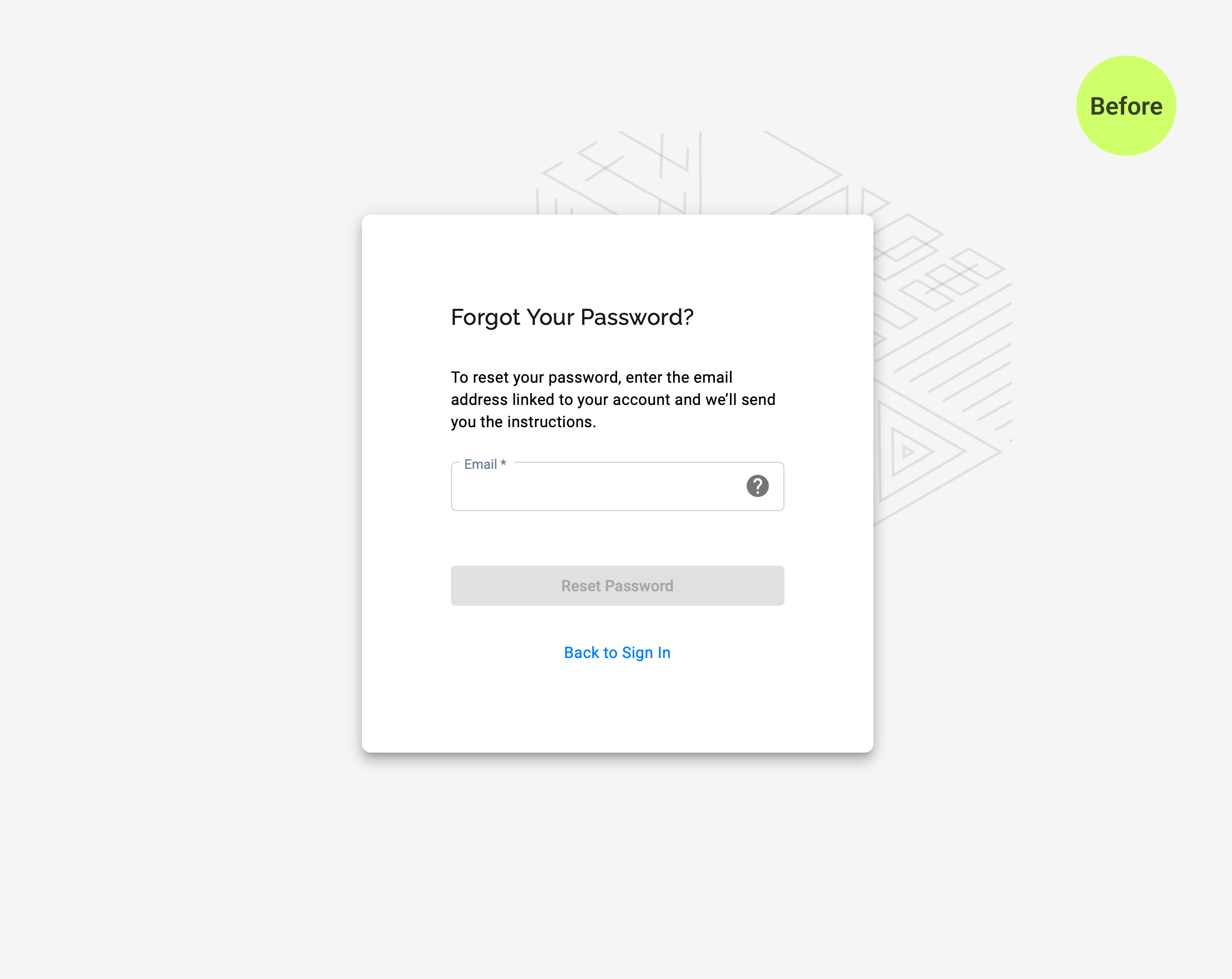
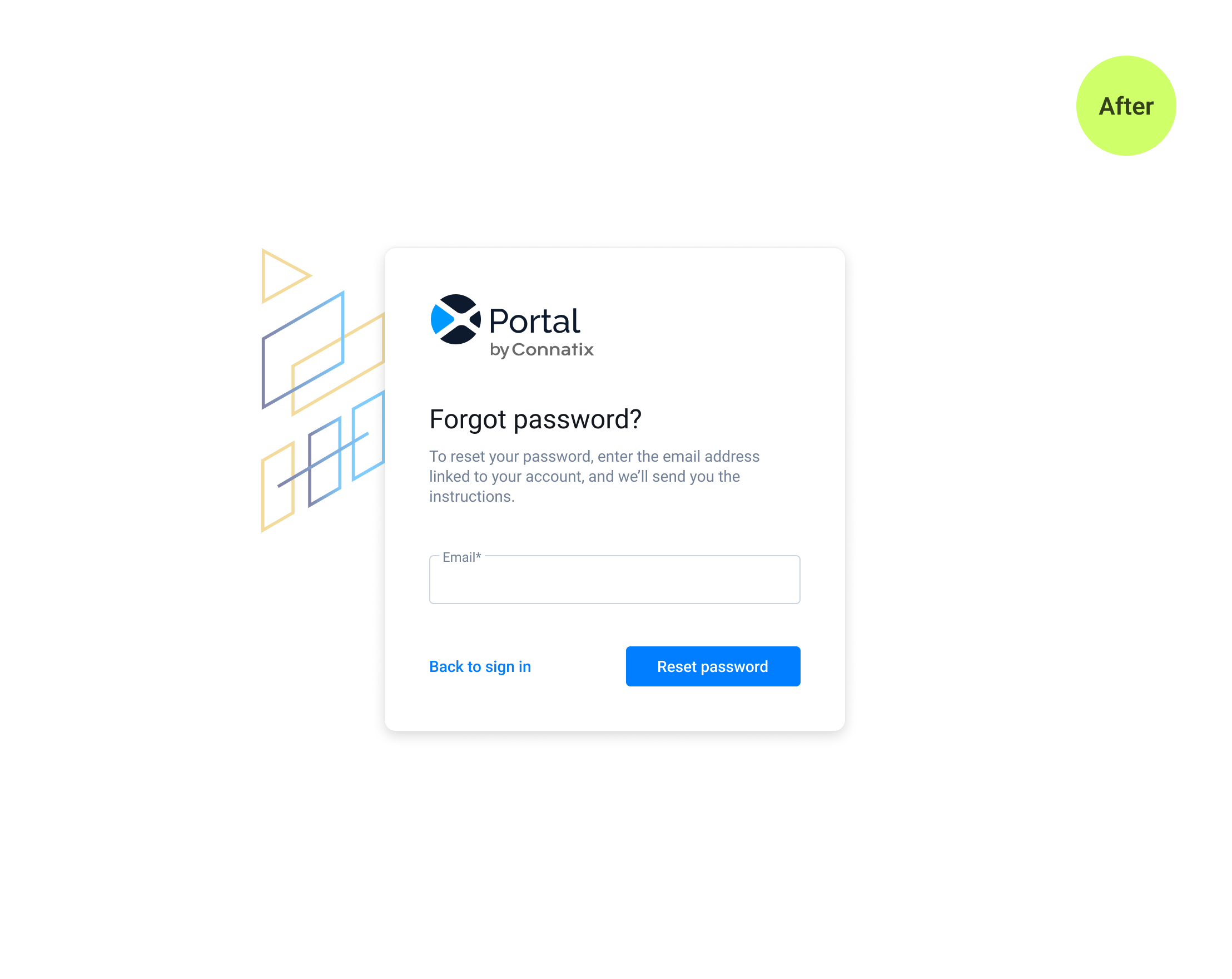
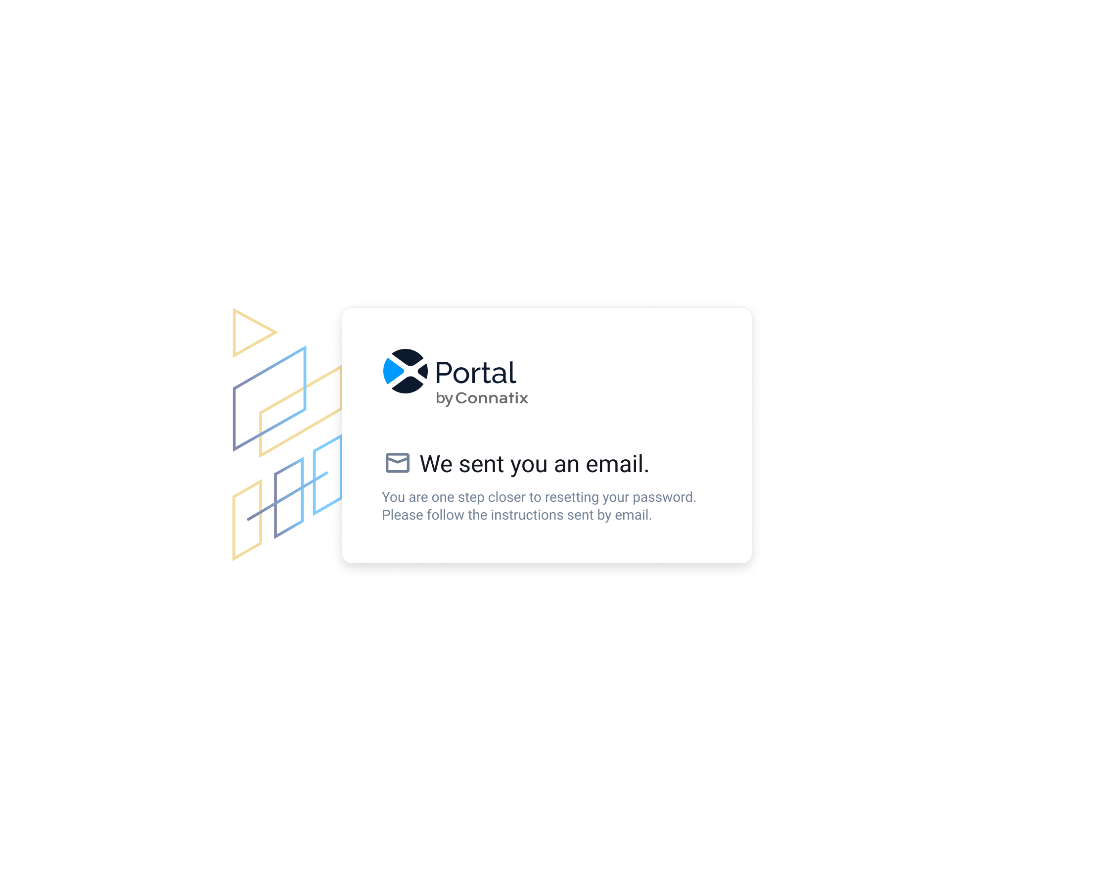
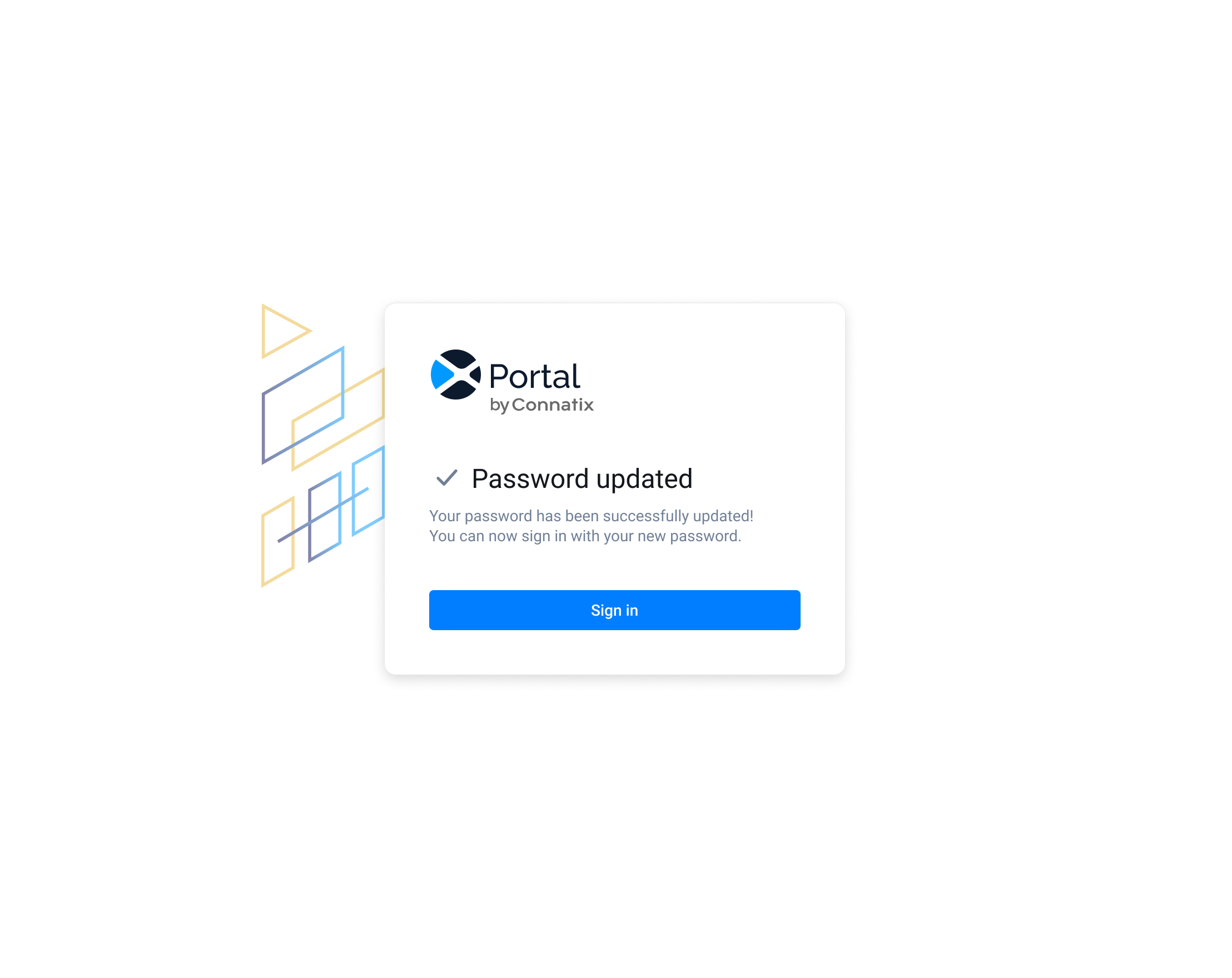
5. Authentication forms
We received feedback that some customers had issues to sign in on certain screen sizes, or their sign up invite expired and didn’t know what to do next, or they were confused about the instructions displayed in the sign up forms. We decided to redesign these forms to make them more accessible and to better inform the users about each step in the process.
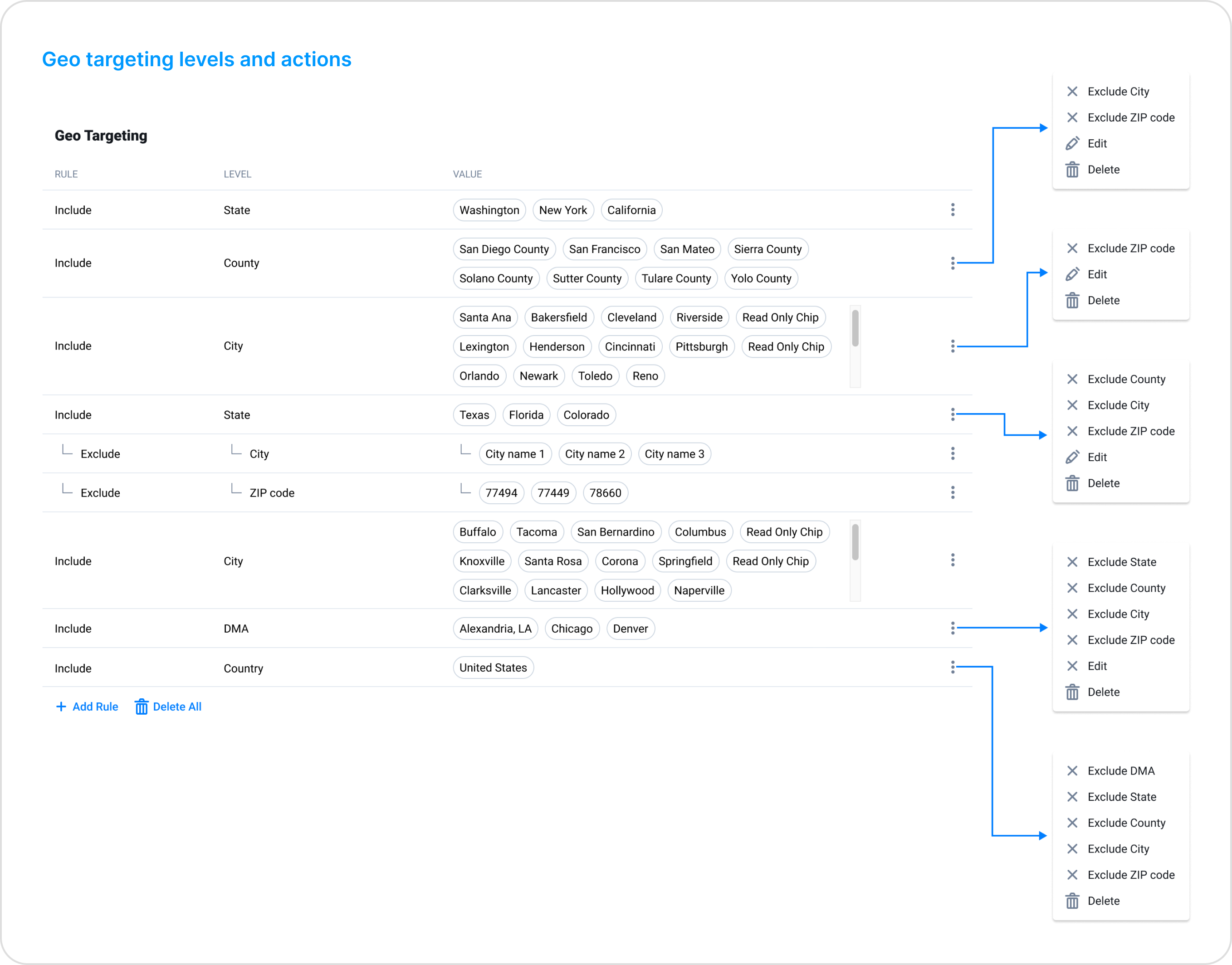
6. Geo Targeting flows
More customers asked if they can apply targeting rules more granularly to better target their audiences, so we decided to introduce more geo targeting levels, such as DMA (Designated Market Area) or ZIP code.
To do this we had to change the current UI, rethink the user flows and also follow the targeting levels hierarcy, so each ‘Include’ or ‘Exclude’ rule to be valid. Below you can see the new targeting levels hierarcy with the actions allowed for each level and 2 videos showcasing how to apply different targeting rules.