Toyota
Case study
During my time at Harman International I’ve been involved in the design and development of a new infotainment system software for Toyota Motor Europe.
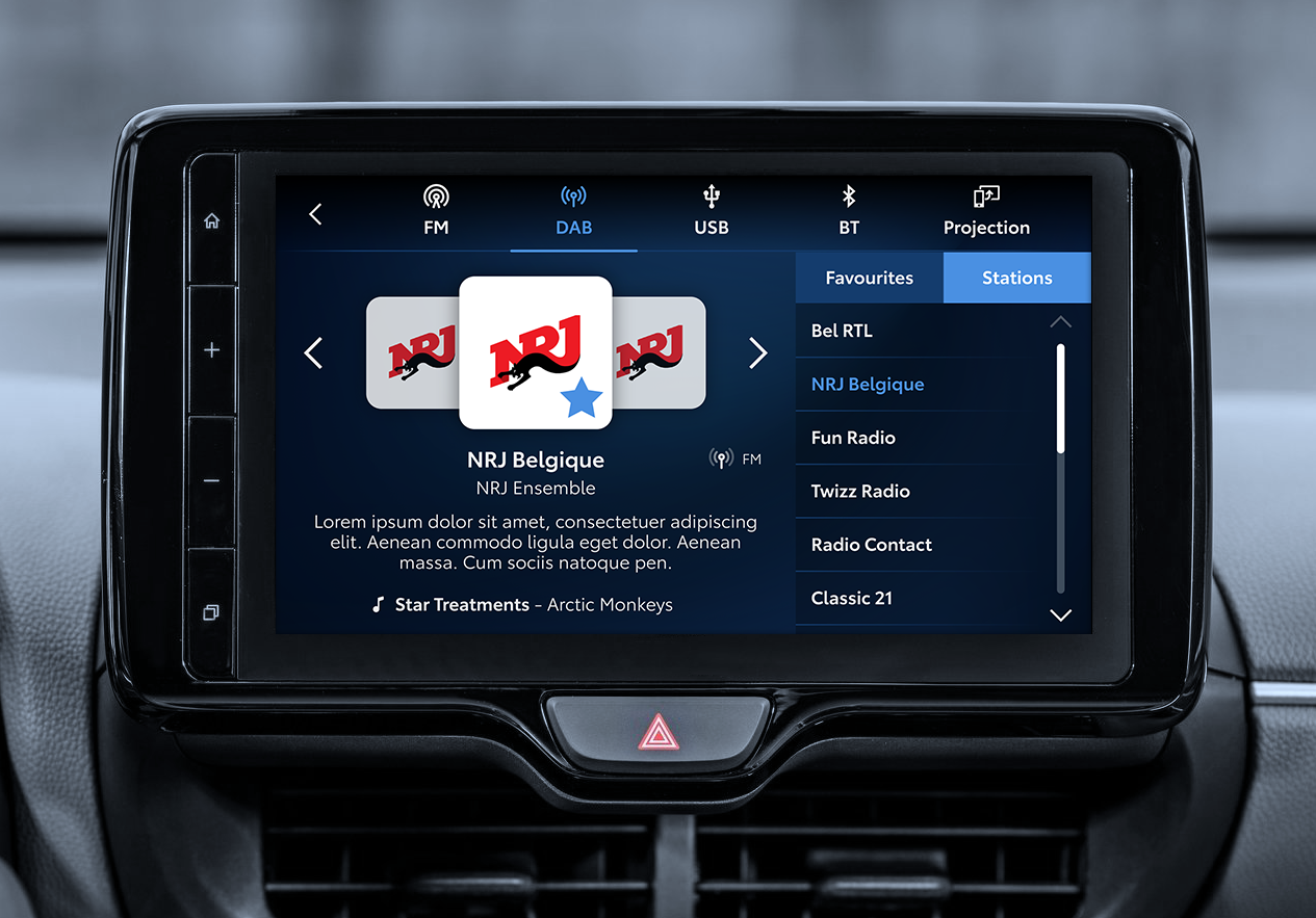
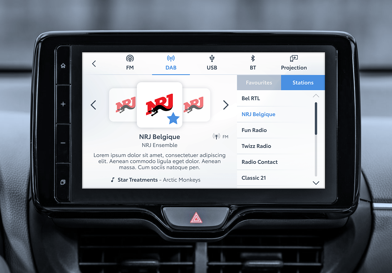
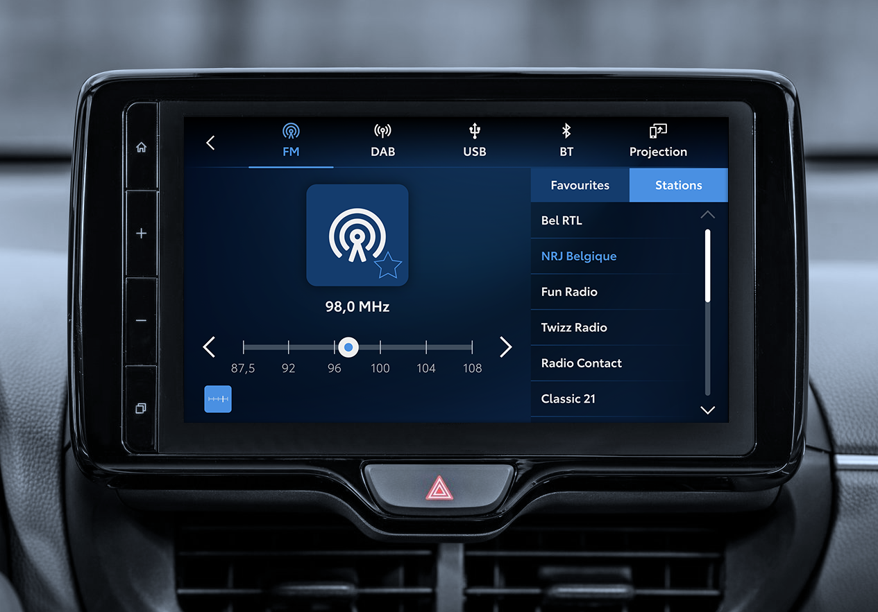
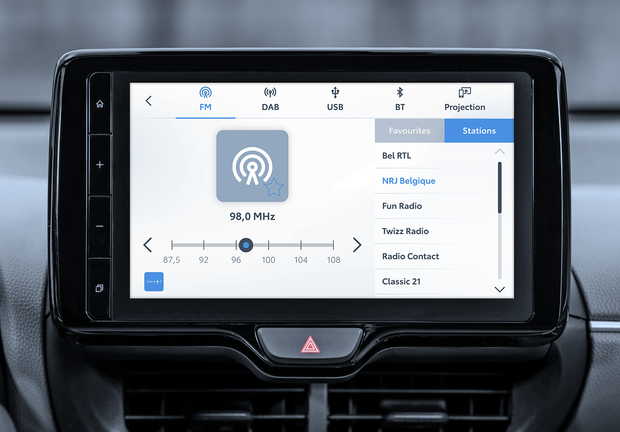
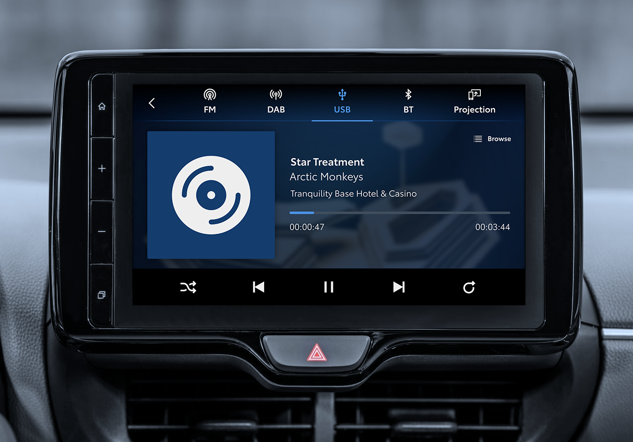
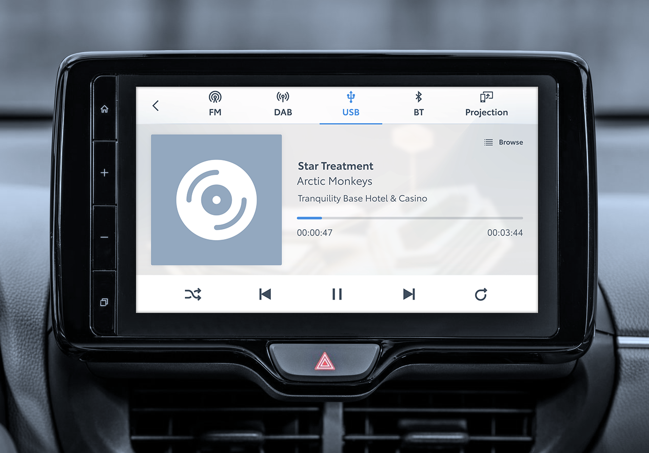
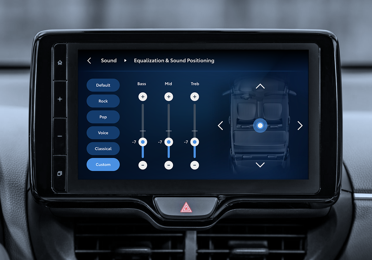
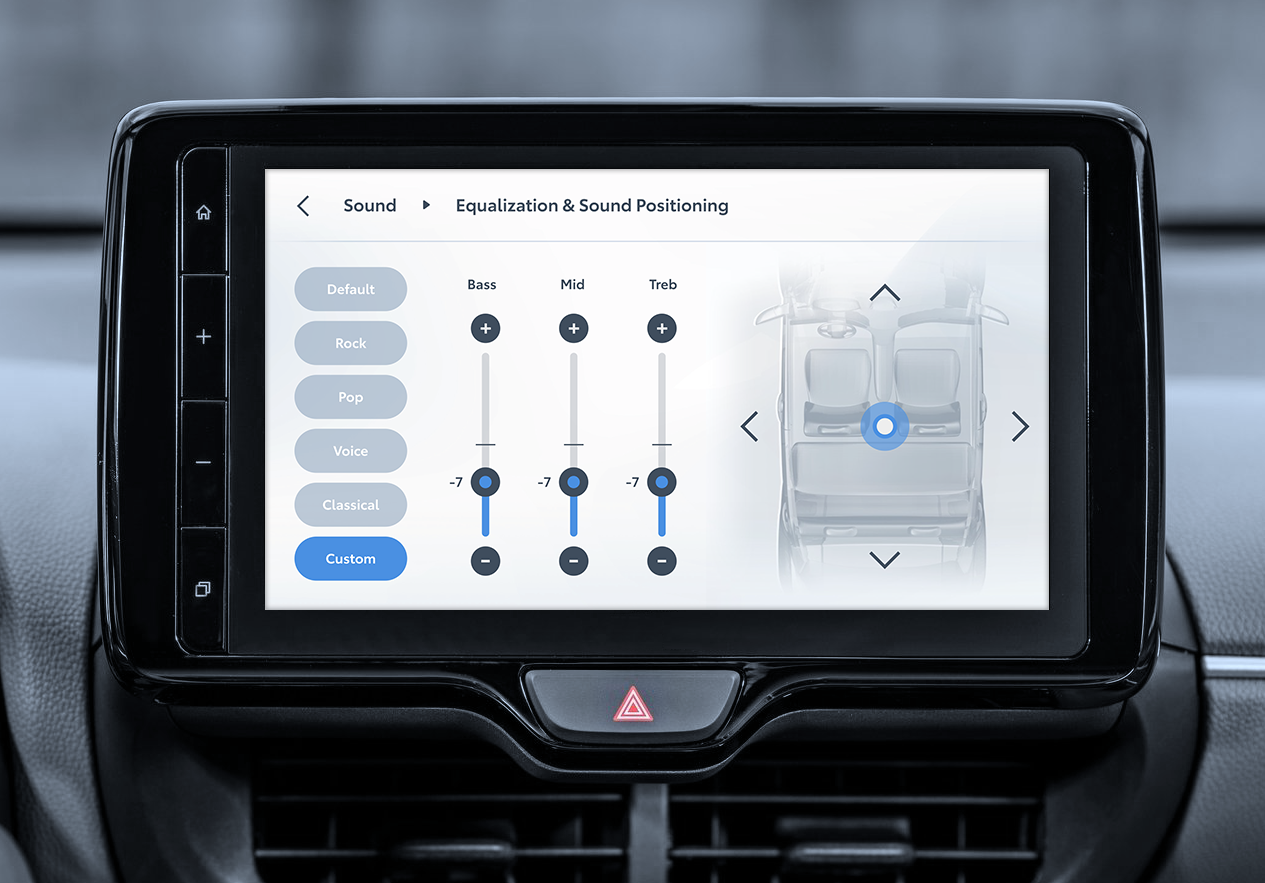
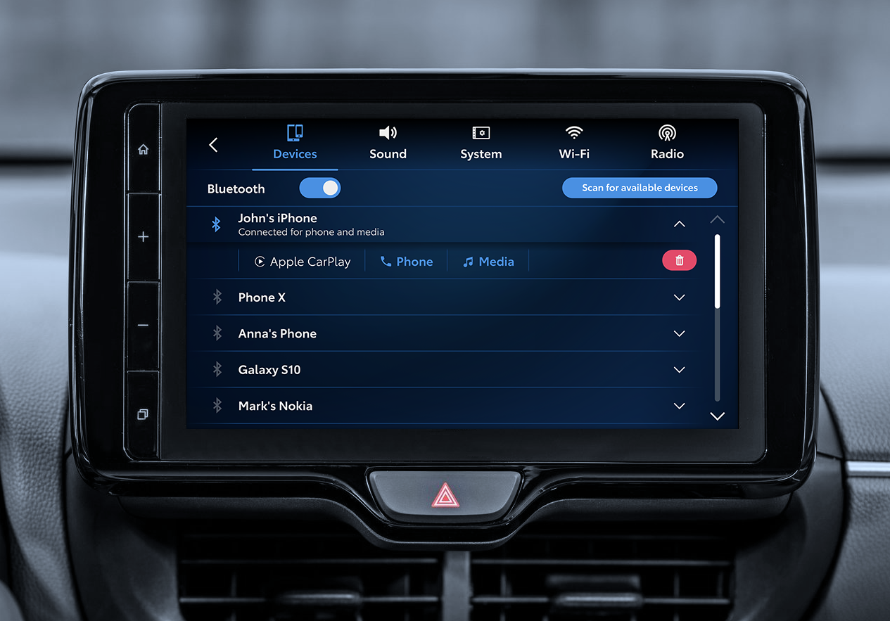
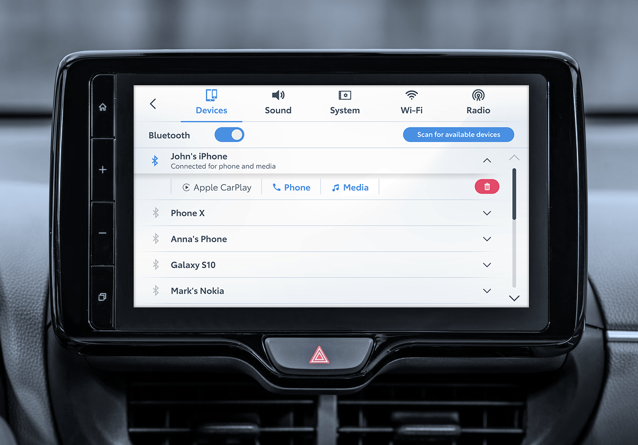
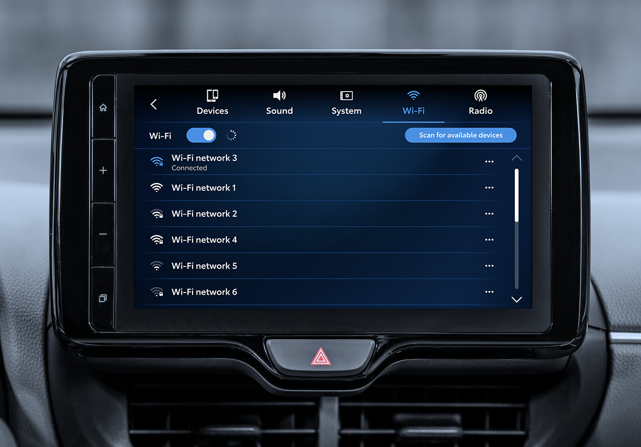
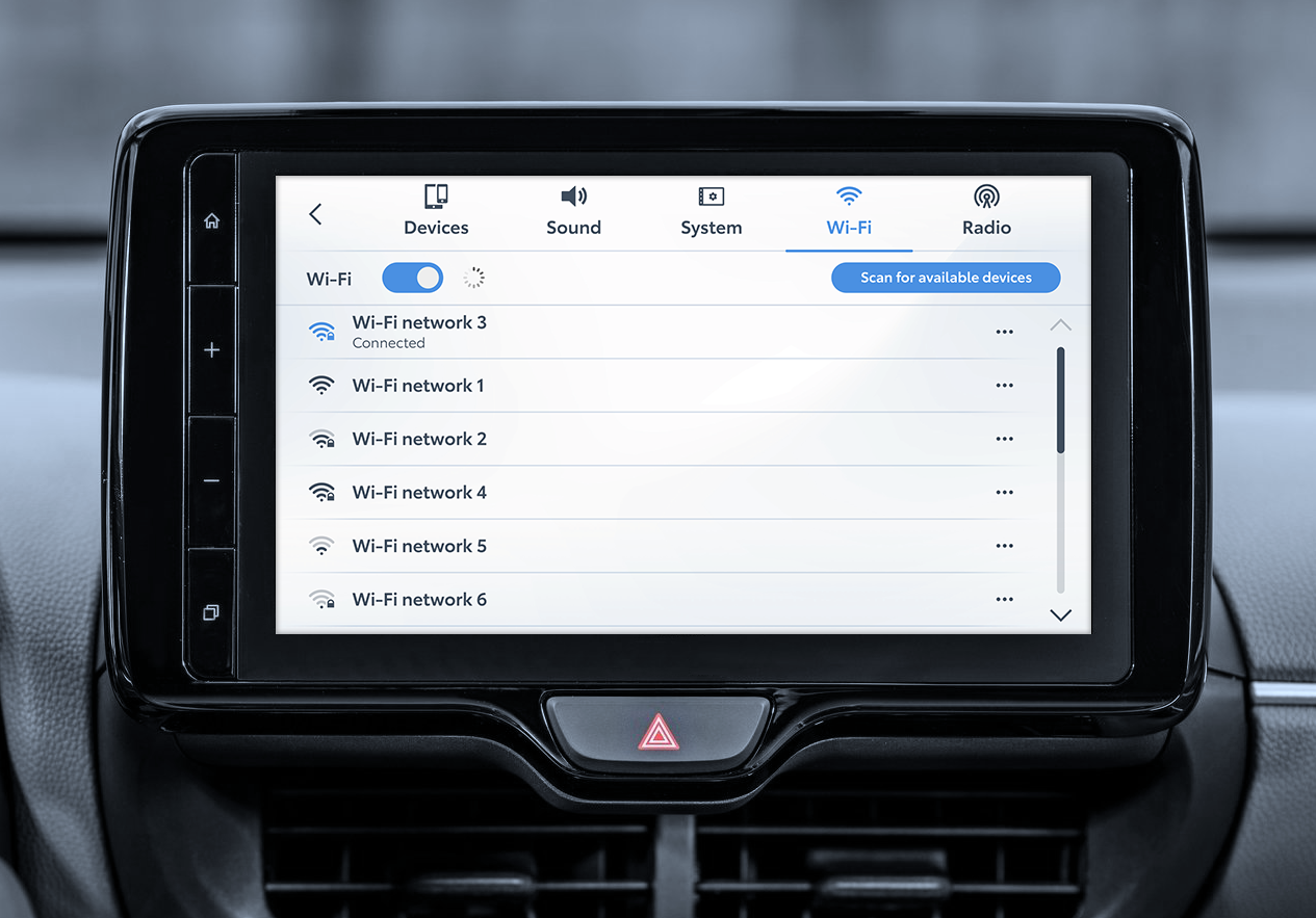
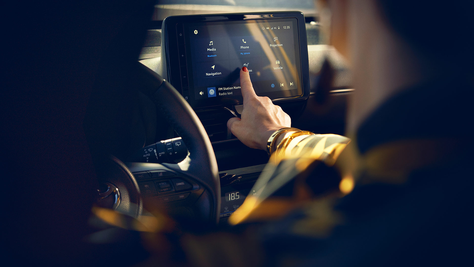
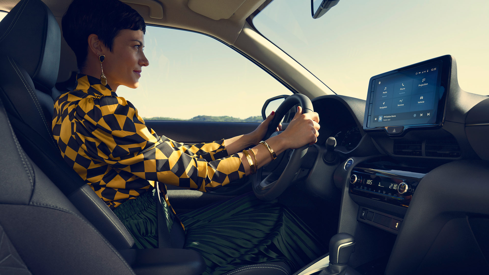
The system is available since 2022 in the Toyota Yaris Cross model in Europe and it features a 9 inches capacitive touch screen, wireless Android and iOS connectivity, a DAB player, equalization and sound positioning settings, OTA updates, energy flow and tyre pressure details, rear view camera video stream. Below you can see a few shots by Toyota showcasing the system:
I was part of a multi-disciplinary team of designers, developers, QA engineers, project managers and other third-parties from the US, Europe and India and I worked directly with the client.
I had various responsibilities, from researching how a specific feature works in other infotainment systems on the market, creating wireframes and flows for the system’s logic and behaviour to designing UIs ready for development and assisting developers during implementation.
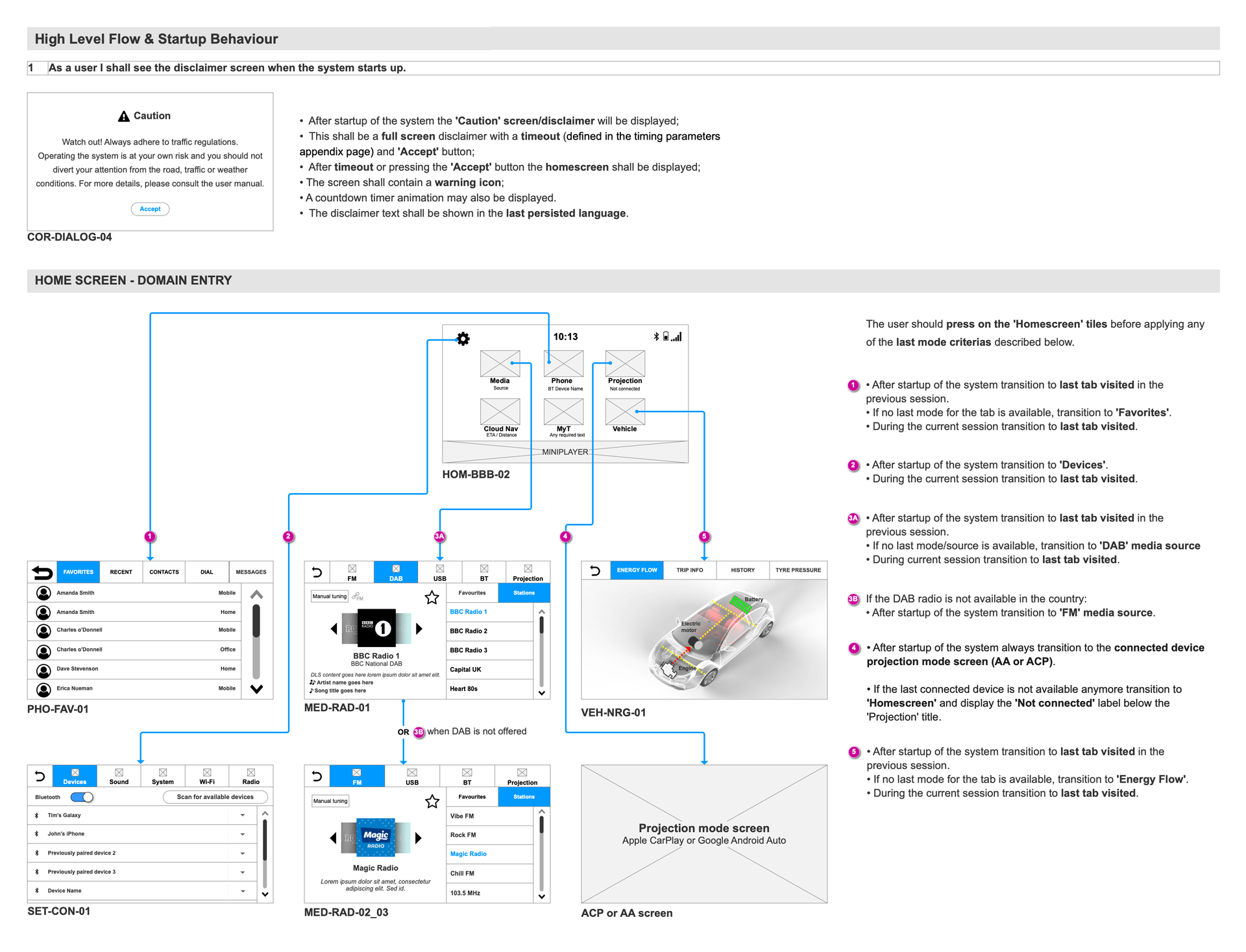
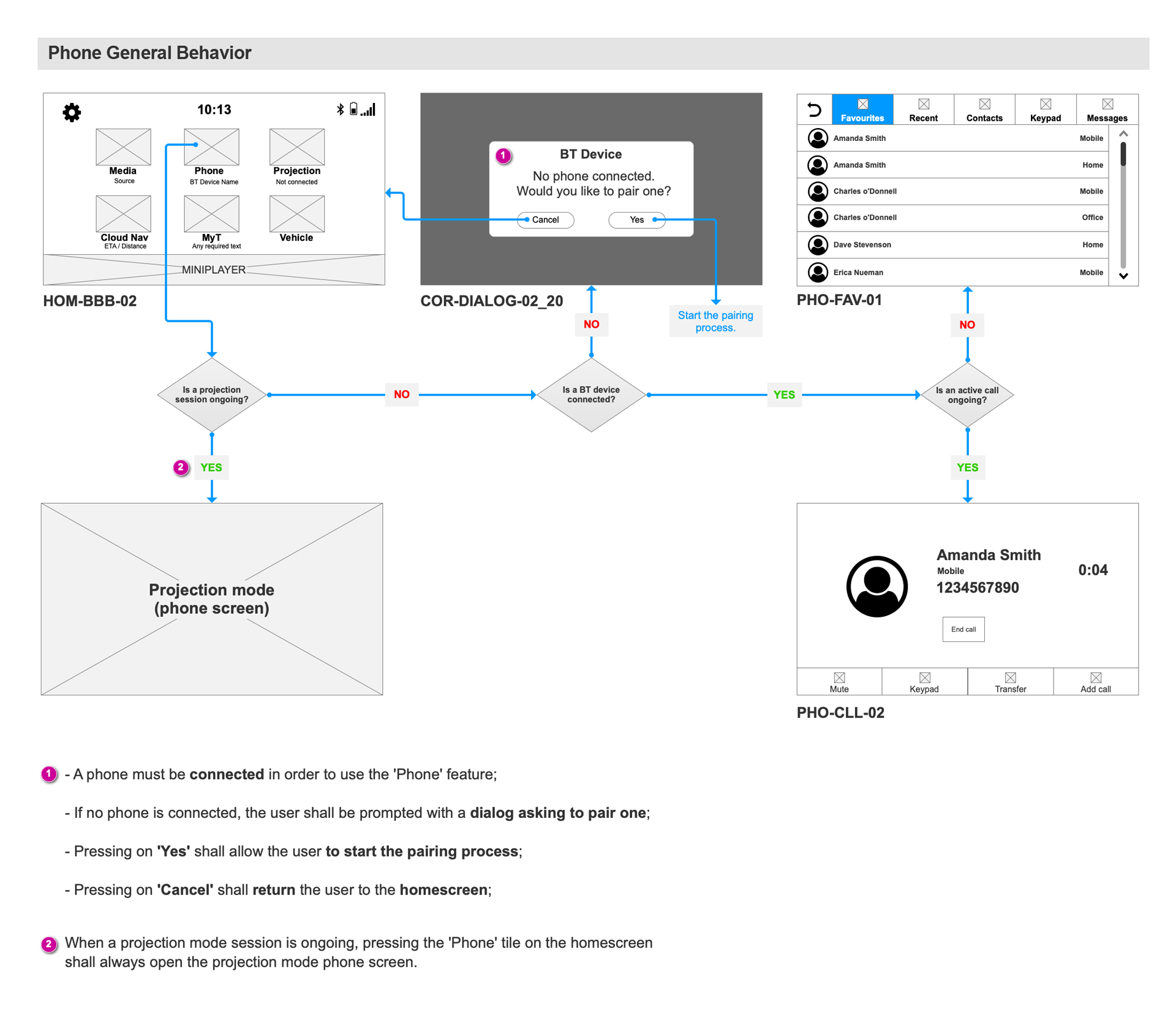
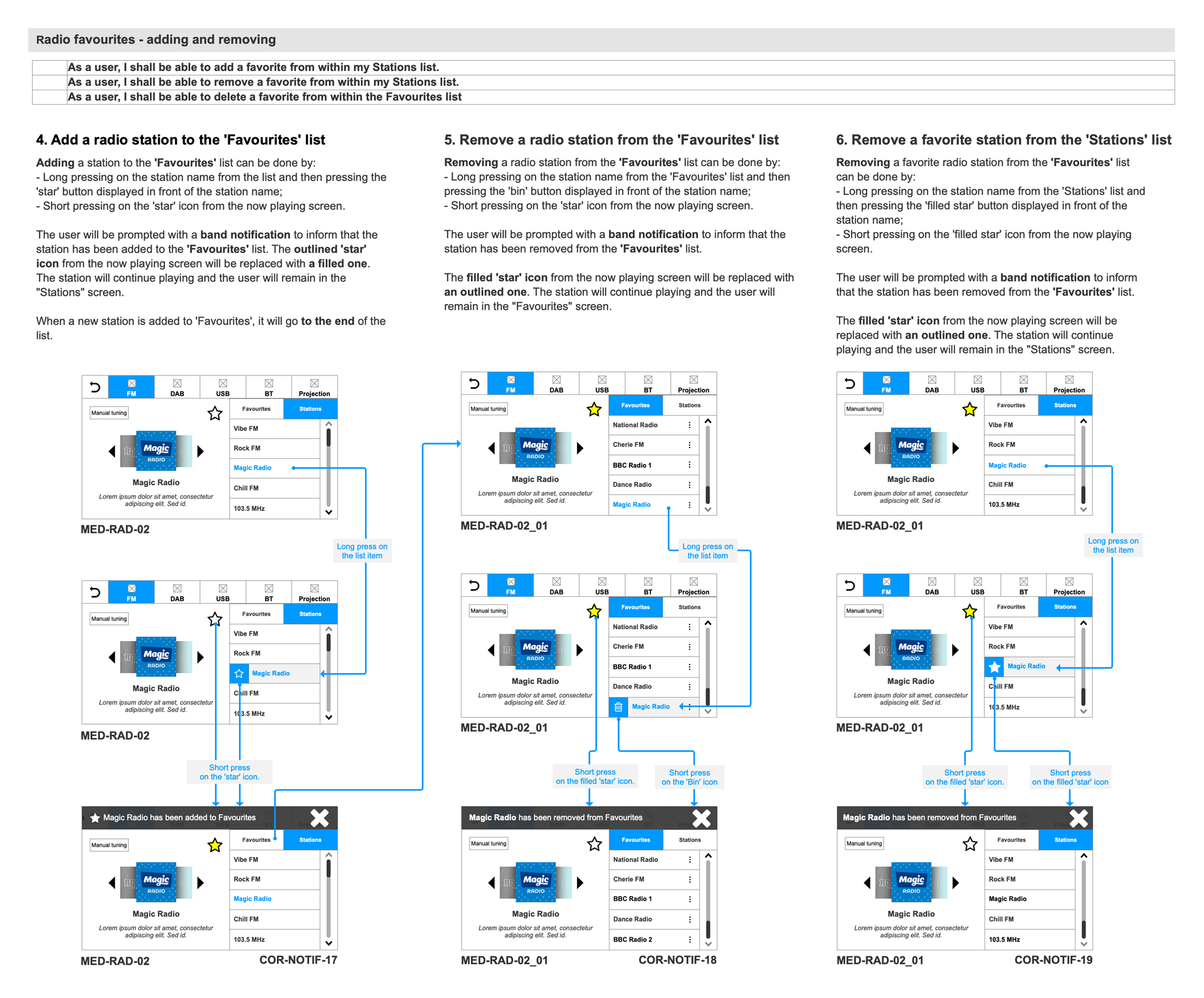
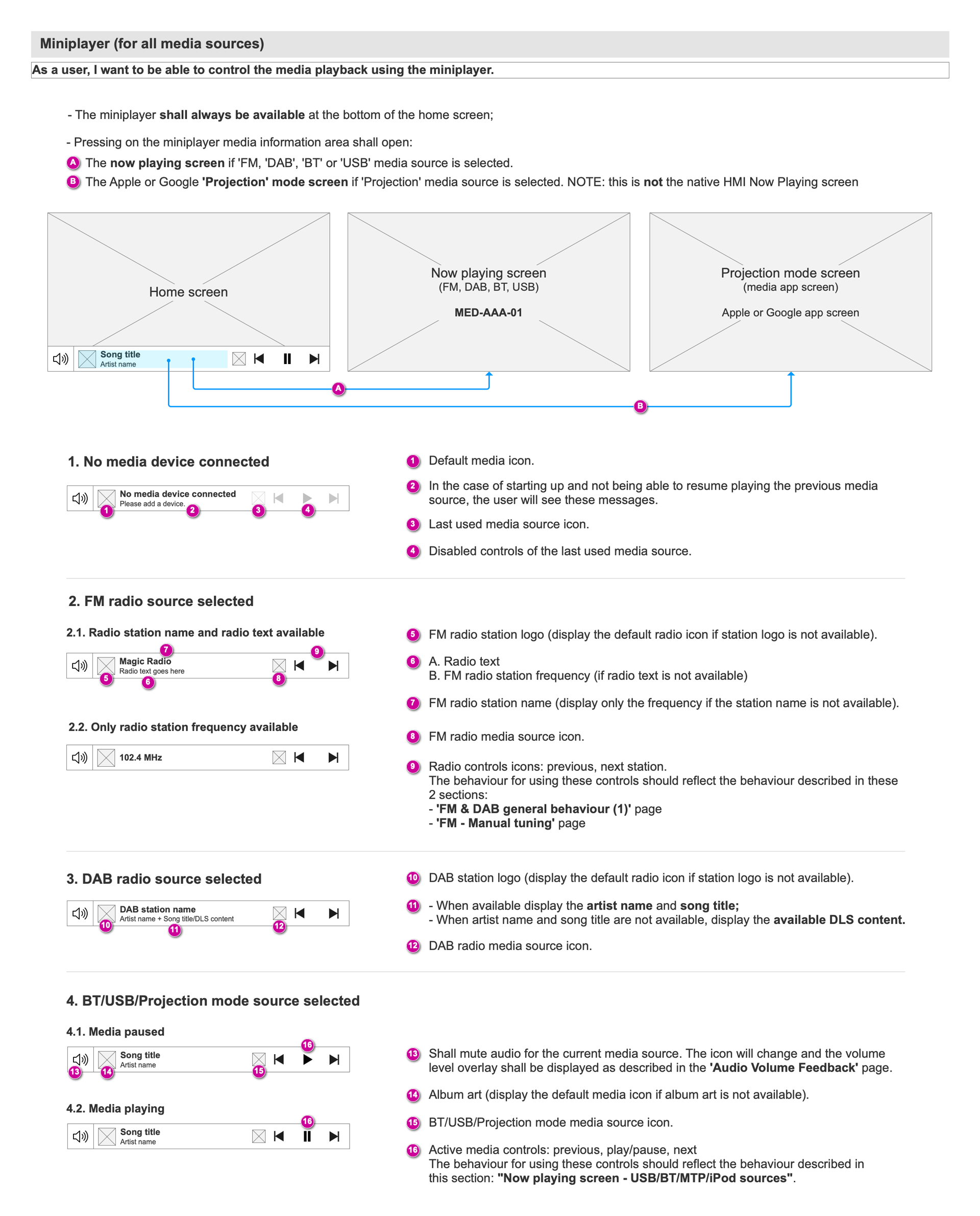
To better organize the planned work, we splitted the system into several areas/domains. This helped us to gradually deliver and test the features.
We used Axure to create the wireframes and to build and document the system’s flows. This acted as the single source of truth for all the parties involved in the early stages of the project, before the UI was created and approved by the client. Below you can see some of these flows and the related documentation:
To design the UI we used Photoshop in the beginning, but due to the fact that the team was globally distributed, we quickly switched to Adobe XD. This helped us to create and share our design work faster and to better organize the UI assets into groups, per domain or feature. We also made the developers happy because they didn’t have to wait for someone to export assets for them or to ask about any styling properties.
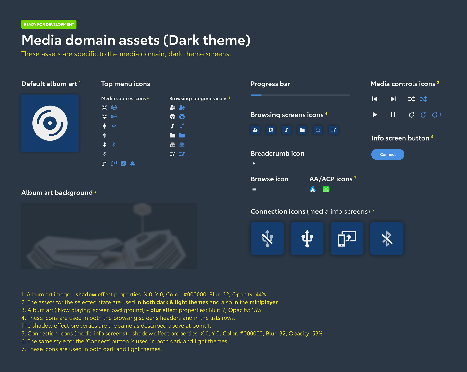
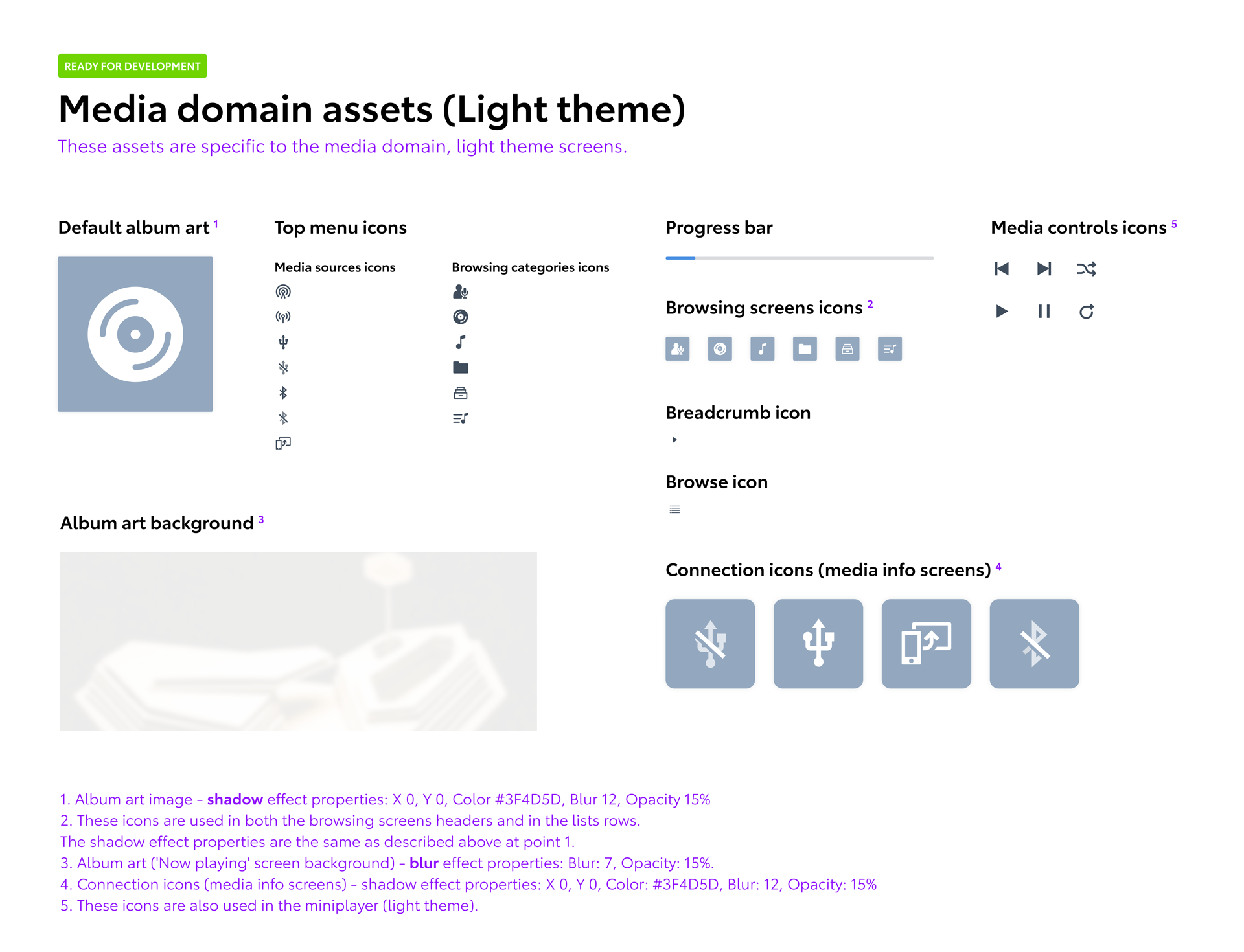
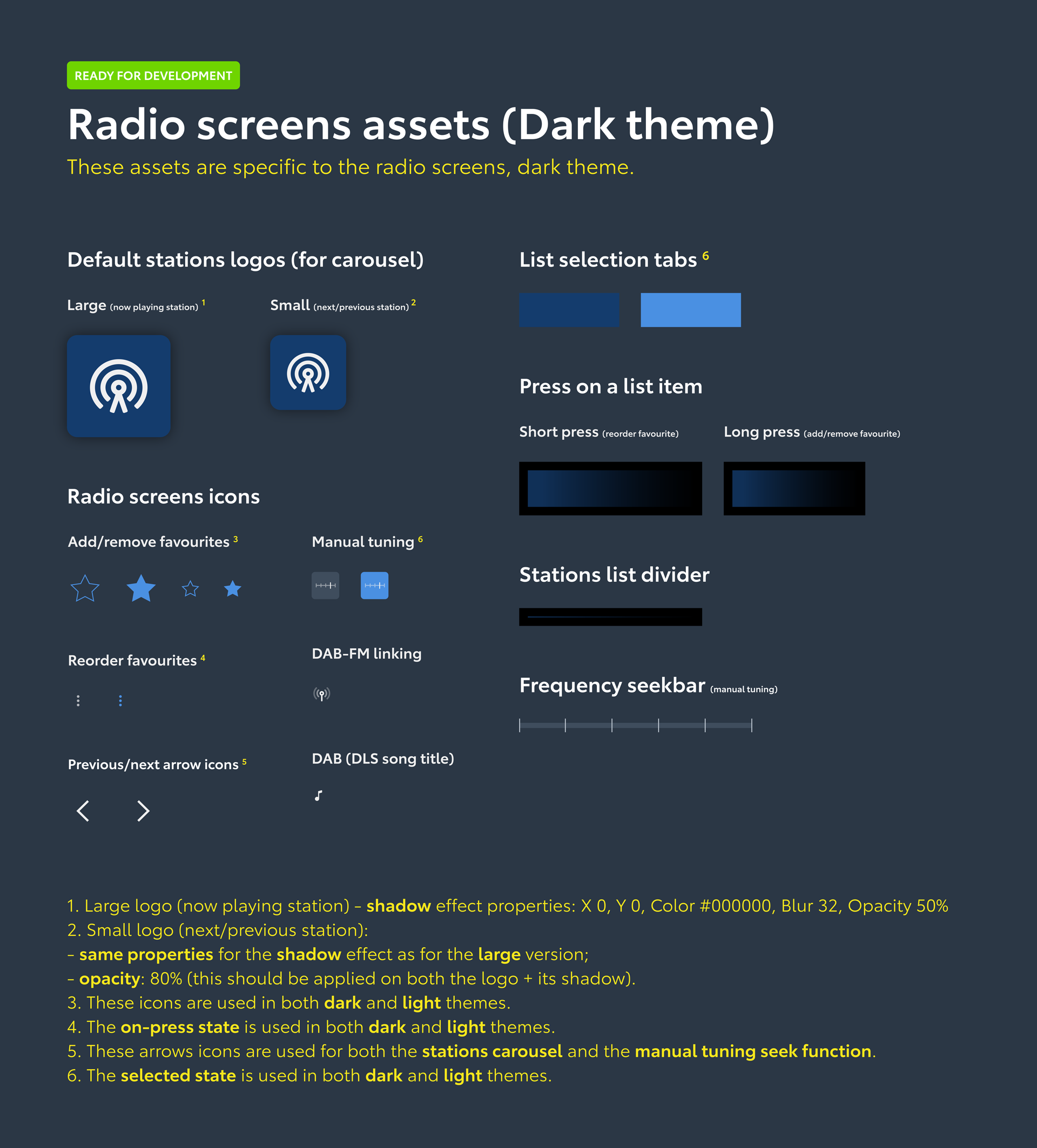
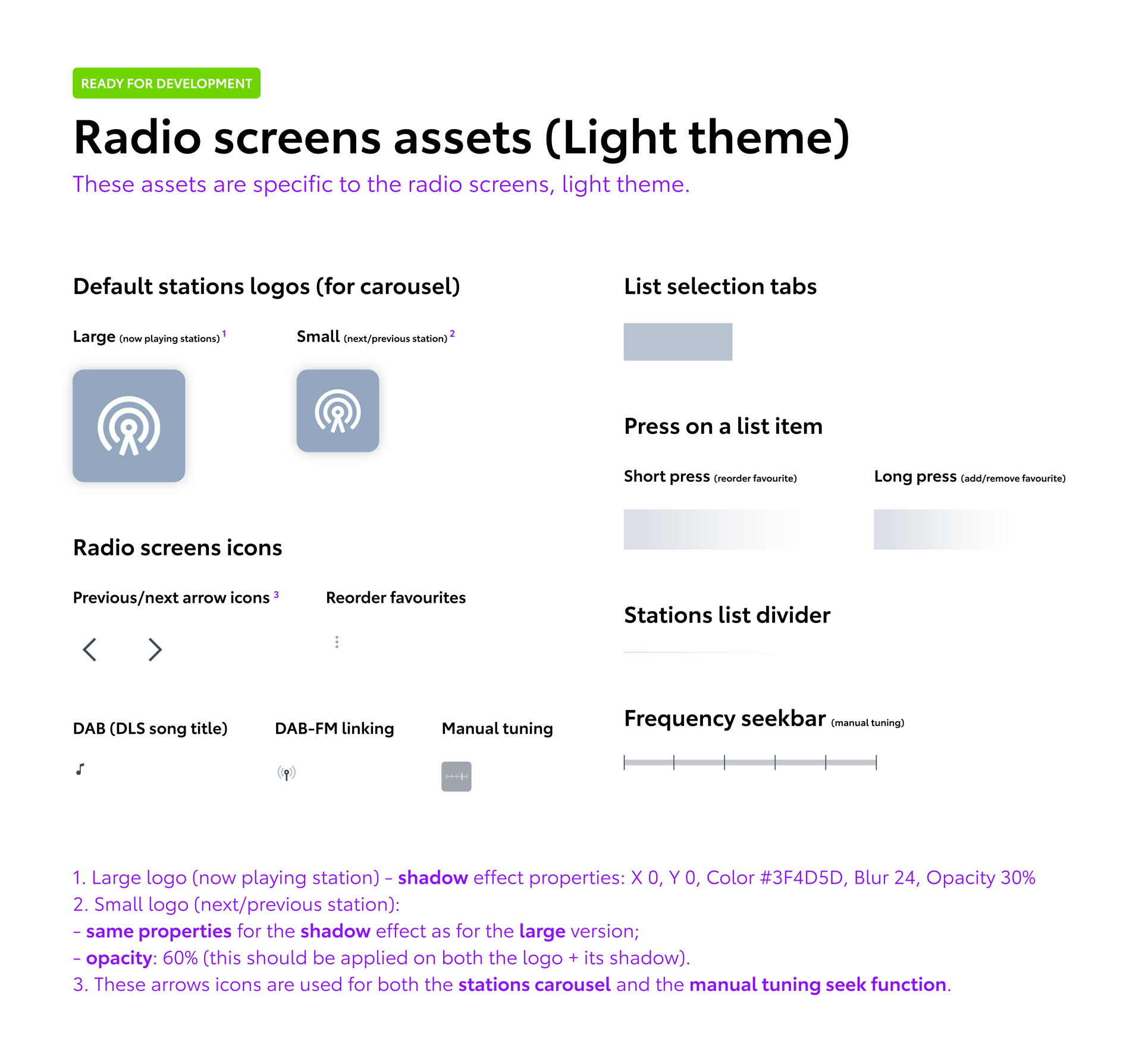
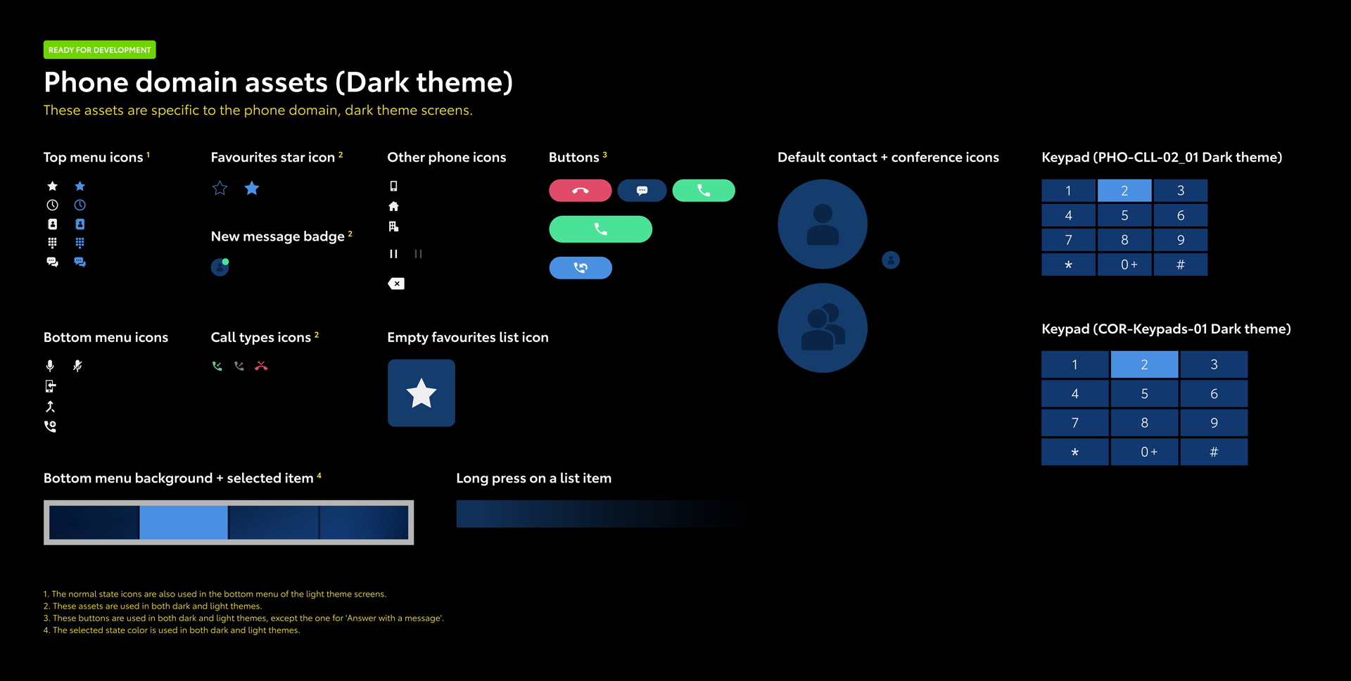
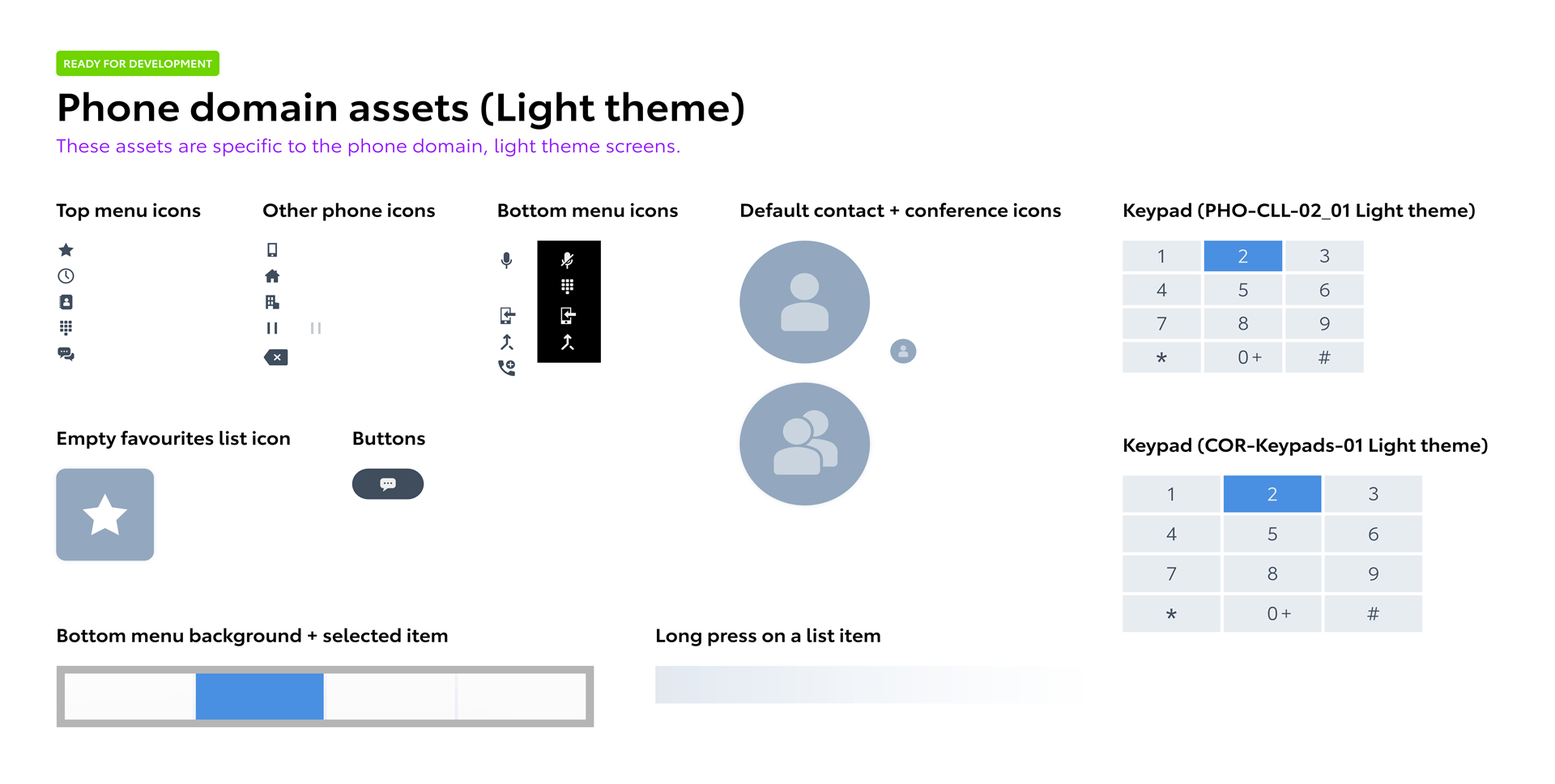
We established naming conventions for all the screens and assets, which improved tracking and the communication between teams. Each screen had an ID and a description associated with a domain (e.g. “MED” for media, “PHO” for phone) and the name of each UI asset included a reference to a specific screen or domain.
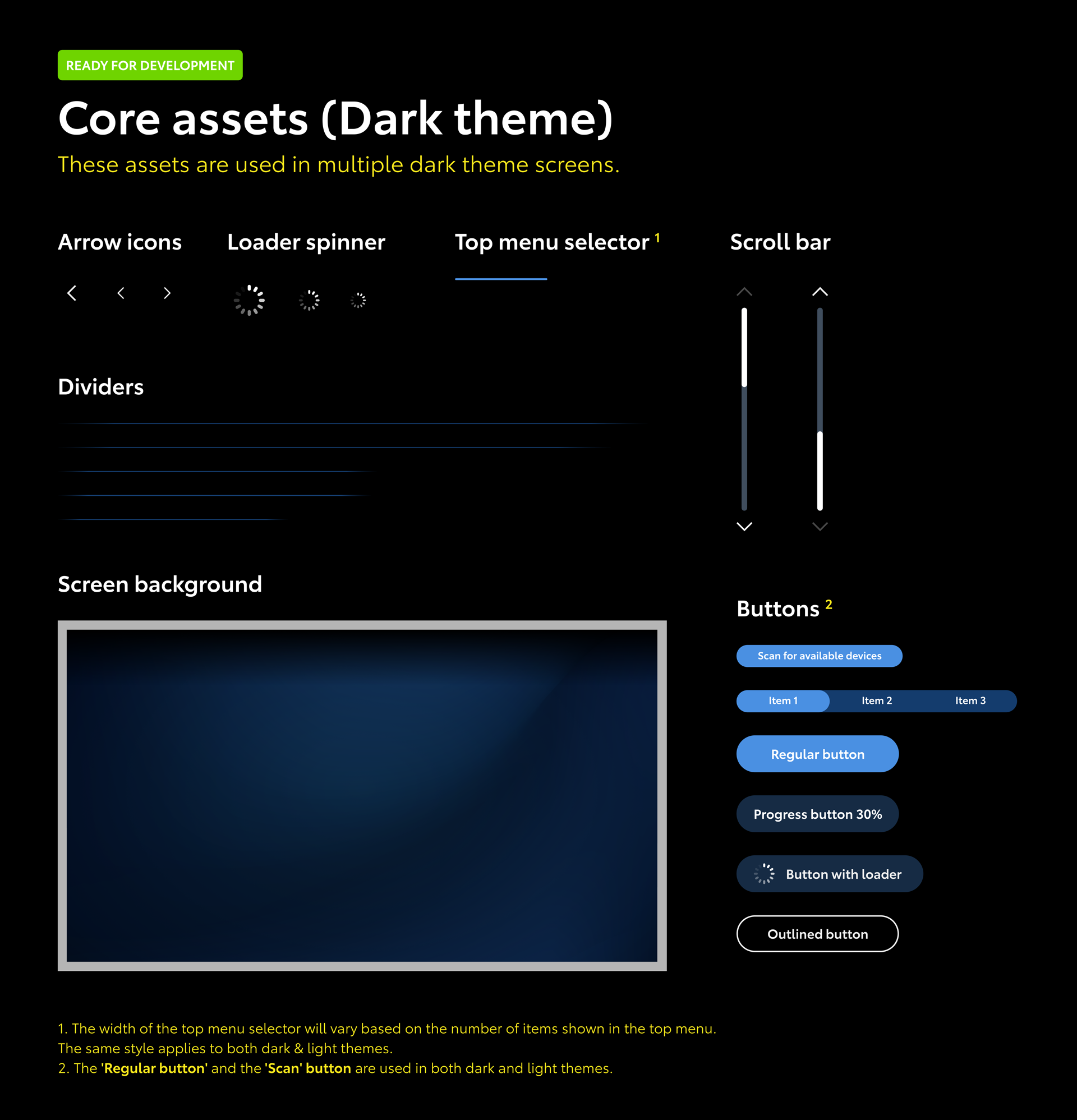
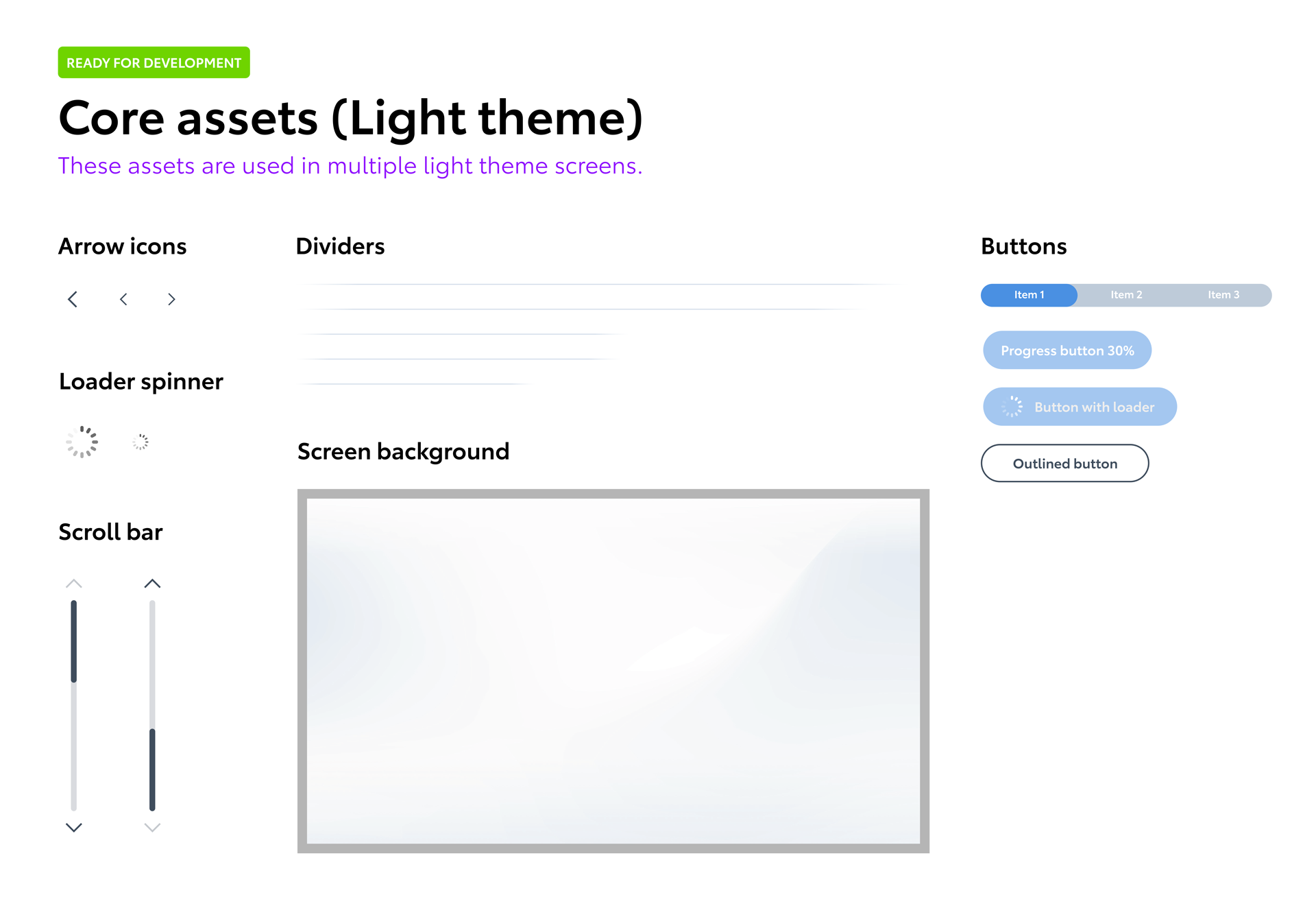
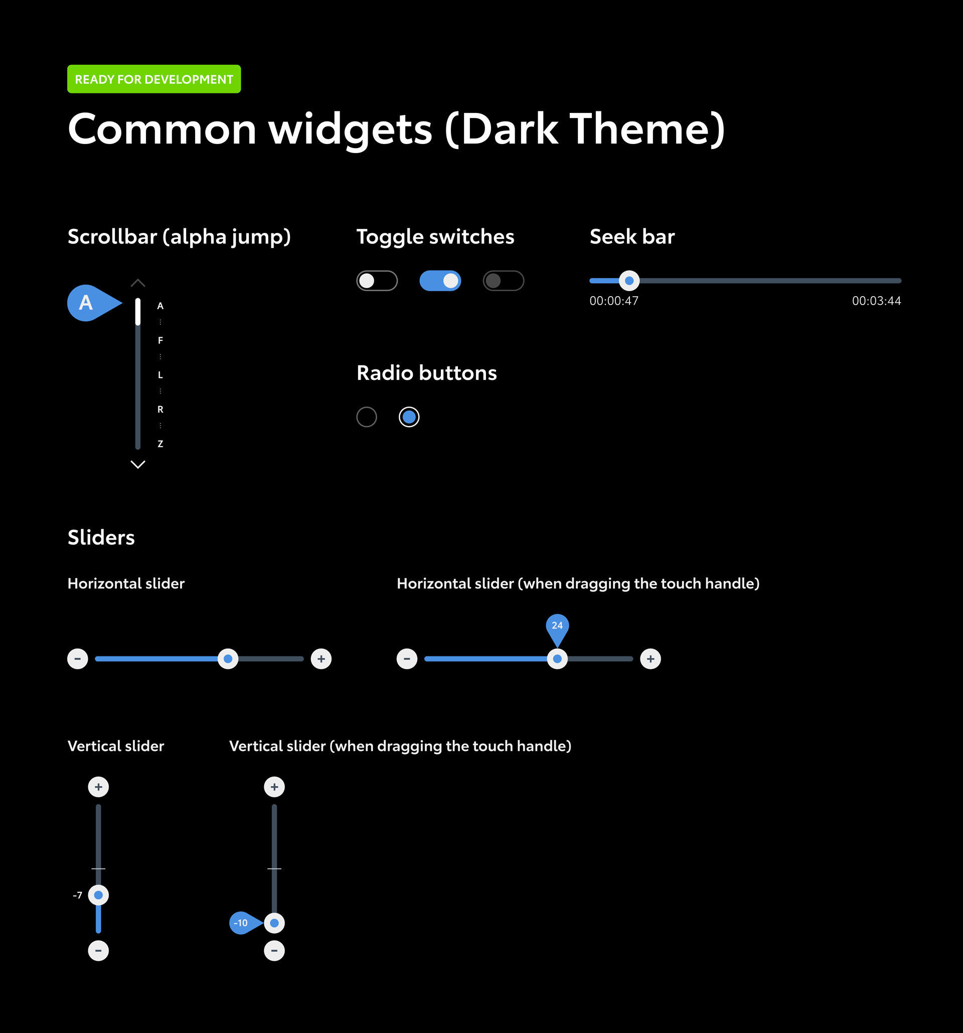
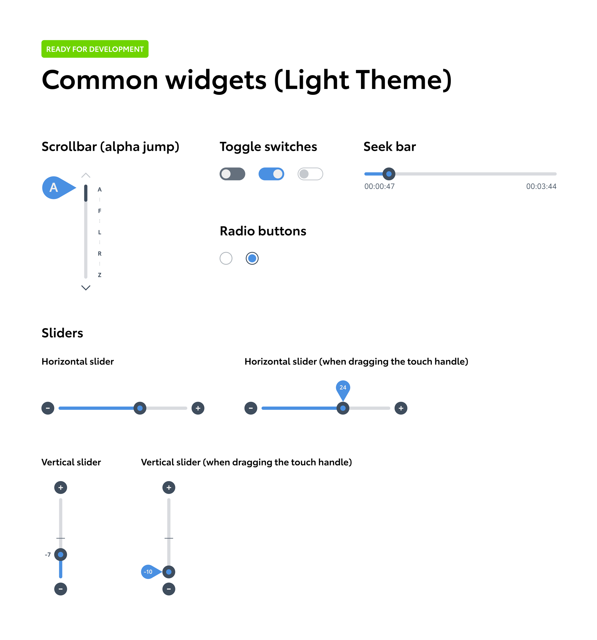
We put together all the screens and the assets into a main styleguide file, for both dark and light themes, together with notes about specific cases and usage scenarios. Below you can see a preview of this:
It took more than 3 years for the system to be built (hardware and software) and to be launched to the market, but I’m glad I’ve been part of it. Below you can see the final UI design that went into production, showcased on the Toyota Yaris Cross headunit and a UI walkthrough video by SDA Dan Cars: